Quantcast
Channel: Tedium
Viewing all 978 articles
Browse latest View live

Chartered Waters

$
0
0

Chartered Waters

Being gatekeepers, music charts have a massive influence on the songs we hear on the radio. And that influence isn't exclusive to Billboard, by the way.

Today in Tedium: As a fan of the underdog, I love reading the bottom half of music charts. Forget Billboard's Hot 100; I wanna see what's happening on the Bubbling Under Hot 100 chart, if that indie band I'm digging actually has a chance of breaking into the top half. (Oh, who am I kidding? I spent the last week listening to Hüsker Dü and American Music Club. My taste is off the grid these days.) Forgotten in the age of modern pop charts is the fact that Billboard has never been the only game in town. Today's Tedium talks charts. — Ernie @ Tedium


1940

The first year Billboard had a music chart of any kind. The magazine, founded in 1894, spent much of its early history focused on billboard advertising. (Hence the name.) The first music chart, called the "National List of Best Selling Retail Records" and topped by Tommy Dorsey in its initial edition, quickly gave way to more common charts like the Billboard 200 and Hot 100.


Chartered Waters

The researcher who was murdered, mob-hit style, after taking a stand for music-chart integrity

Of the many names that have been associated with Nashville's Music Row, Kevin Hughes doesn't have the star power of, say, Big and Rich.

But Hughes stood for something really important: With the small amount of power he had, he tried to make the music industry in Nashville a little less corrupt, and for that, he became something of a folk hero. Unfortunately, folk heroes rarely survive to the end of the story.

Hughes, a 23-year-old researcher for the Billboard competitor Cash Box, noticed something unusual with the magazine's independent country chart: Some of the artists were getting high placement on the charts despite never actually getting played on the radio or selling any records. Not willing to stand for payola practices, he pushed back against schemes to manipulate the chart, something that record promoter Chuck Dixon had long been accused of doing. Dixon was not the kind of guy you wanted on your bad side.

“He watched The Godfather—parts 1, 2 and 3—four or five times a week,” Gary Bradshaw, a colleague of Dixon’s, told Nashville Scene. “It was unreal.”

Bradshaw told the alt-weekly that the scheme worked like this: Dixon would get paid money by musicians to get on the charts, and he would use some of that money to wine-and-dine DJs, who would then take steps to promote whatever musician he wanted to get on the charts at the time. By taking advantage of the fact that both aspiring musicians and DJs were each essentially broke, Dixon made a ton of cash.

But when Hughes came along, he proved a threat to Dixon's scheme—and Dixon allegedly requested that a hit be taken out on Hughes. In the final days of his life, Hughes knew he was on thin ice.

"He was very concerned about something, you could tell by the tone in his voice, he was nervous, and almost scared," his brother Kyle told ABC News of the last time he talked to his brother. "At the end of the conversation he told me he loved me on the phone. And when he said that I knew something was wrong because we didn't talk about that on the phone."

An hour later, Hughes was dead, shot at point-blank range after leaving a studio with a friend, country singer Sammy Sadler. Sadler was shot in the shoulder, ran away, and survived.

"One minute, I'm getting into the car with a friend, and the next, a guy in a ski mask, wearing dark clothing approaches and opens fire," Sadler said in a 2003 comment on the case.

For more than a decade after the March 9, 1989 shooting, it was unclear who did it. This made Hughes' murder prime fodder for shows like Unsolved Mysteries, which did a segment about his death in 1990.

It took until 2002, three years after Dixon died, for a suspect to appear in the shooting—Tony D'Antonio, a former Cash Box editor, who was convicted and sentenced to life in prison the next year. Dixon never admitted any role in the shooting, but his death did help break open the case.

D'Antonio died in prison in 2014.

Stories like these severely hurt the reputation of Cash Box, a trade paper initially built around tracking trends in the jukebox industry, and it went under in 1996. It once had the reputation of Billboard, but lost that as the magazine gained its association with payola. In recent years, however, the magazine was revived as an online-only publication.


"I wanted to do something a little more unique. It looks good on college applications, but mostly I do it because it's fun for me."

— Matt Levine, an early newsletter author, explaining in a 1997 interview why he created a personal weekly chart of his top 50 alternative rock songs. Matt Levine's Top 50, which he started while just a teenager, was an early Usenet and email hit, and at one point led Levine to work on a music site called Alternative Rock World. Levine's chart, most issues of which can be found in this Yahoo group, went on for more than a decade, and exactly 600 issues, before he gave up on it in 2007.


Chartered Waters

(steviep187/Flickr)

The guy who spent his teen years trying to make modern rock radio suck less

These days, the modern rock charts couldn't be further from Matt Levine's mind. He has something more important to worry about—being a dad.

Levine, who lives in Edmonton these days, is a Canadian by marriage. But when he was a teenager, he lived in the Los Angeles area, within earshot of one of the most-influential rock radio stations in the country, KROQ.

There wasn't any grand plan behind it; he was just a bored teenager with a lot of extra time in 1995. ("I was 13, living in a Southern California suburb without any sort of public transportation. And it was too hot to go to the park and play basketball," Levine explained.)

He stumbled upon a site called Top Hits Online, later called BeyondRadio, and began submitting charts of his own. Eventually, he decided to launch his own website and newsletter. The favorable L.A. radio market gave his chart something of a natural advantage—before the MP3 era, he was able to catch songs on the radio dial before they broke nationally.

Levine built charts that mixed local radio airplay and his own tastes. Then, as now, alternative rock radio stations needed a little help understanding what was cool and what wasn't. And Levine's chart, which he sent to radio programmers around the country, was a way for programmers to understand what an actual teenager thought was worthy of a few extra plays—why, for example, an underdog band like The Flys or Matthew Good Band deserved notice, or why Hoobastank was (as he put it) "the second coming of REO Speedwagon."

"The charts weren't particularly scientific, but I aspired to have the songs have trajectories similar to Billboard charts," he explained. "The idea was that I could influence what rock radio stations would play around the country."

His chart won an audience at a time when Pitchfork was embryonic, Rolling Stone was already corporate, and publishers were still trying to make CD-ROM magazines a thing. As a result of that influence, he started to get interviews with a number of bands of the era—he specifically cites The Bloodhound Gang and Loud Lucy—and got into shows as a legit member of the media.

"Probably the biggest highlight was going backstage at the 1999 Warped tour, meeting and interviewing a bunch of bands I liked at the time. I don't have an Almost Famous kind of story to tell, but there were lots of cool little experiences that sprung from the chart," he said.

The chart even played a role in Matt's application to the University of California at Berkeley, where he once hosted a radio show, and his early work in online marketing. Eventually, though, he grew up, and as he moved into his 20s, he struggled to keep up the momentum on the chart that he breezed through in his teens. At the time when Issue 600 went up—three months late, by the way—he was plotting out a massive international trip with his then-girlfriend, whom he later married. And, after roughly 12 years of charting nearly everything he was listening to, that was that.

These days, he occasionally tries to keep up with the radio as well as what's buzzworthy, but he noted that the key driver of his playlists these days is the kids' music his daughter listens to. (She digs the Laurie Berkner Band's "I Know a Chicken" and Elizabeth Mitchell's rendition of "Froggie Went a Courtin'," in case you were curious.)

He looks positively on his experience as a teenage music-industry influencer, saying it made him a better writer, planner, and communicator.

"But directly, the chart hasn't factored at all in my ultimate career," he said. "But this may be due to where I've chosen to live. Los Angeles was an awful place to live in the '90s and I wanted nothing to do with it once I escaped."

Levine has a pretty good life these days—one far from machinations of KROQ or the pop charts.


"Contrary to current theories of musical evolution, then, we find no evidence for the progressive homogenization of music in the charts and little sign of diversity cycles within the 50 year time frame of our study. Instead, the evolution of chart diversity is dominated by historically unique events: the rise and fall of particular ways of making music."

— A section from The evolution of popular music: USA 1960–2010, a 2015 paper written by researchers at Queen Mary University of London and Imperial College London, disputing the idea that the Billboard charts are becoming more homogeneous, while arguing that the charges evolve in a cyclical nature. The paper discusses the way that drum machines took over during the '80s, the way the British Invasion simply took advantage of an already-shifting music market, and how rap basically killed rock music for nearly two decades. Long story short, it's an awesome paper.


Going back to Matt and his little-chart-that-could, I posed a question to him that I've been pondering for ages: Should we still care about charts? Do they even remotely matter anymore?

His take? Not really, at least in terms of these lists worth obsessing over like in the '90s.

"The best thing about Billboard in the 1990s was the use of Soundscan data to accurately determine which albums were selling," he told me. "But now that we live in an increasingly segmented streaming world, sales data matters only from an industry perspective. The money is now all in touring and endorsements—you record a new album to tour behind, rather than the other way around."

Billboard still has plenty of cultural cachet, as evidenced by its awards show, but I wonder if the magazine is simply running on reputation at this point. Levine, however, offers another idea: The influence of Billboard is best seen as osmotic—there will always be an audience for people who don't care very much about pop charts, and just want something to listen to.

"As a father, I don't have much time to dedicate to discovering new music," Levine said. "So Billboard, combined with a number of Canadian radio promoters, influence what I listen to."

For those of us who want to go off the grid, though, we're free to ignore the Hot 100 without consequence.


Purple Copyright Eater

$
0
0

Purple Copyright Eater

When Prince died this week, he left behind a massive legacy of music. He left behind an equally massive legacy of copyright enforcement. Here's why.

Today in Tedium: In losing Prince Rogers Nelson, we're losing a lot more than a idiosyncratic pop star who defined an entire New Power Generation. We're losing the last link between our current remix-heavy culture (which, let's face it, this newsletter wouldn't exist without) and an era when ownership of creative work was treated as an end-all-be-all. Here was a guy who started the internet era sporting a name that literally could not be searched, who forced lawsuits over barely-noticeable renditions of his songs in YouTube clips, and who made a lot of creative stuff that nobody will likely ever see. For all the groundbreaking work he created as a musician in the 20th century, his approach to the internet and copyright was shockingly old-school, and one that should be studied for centuries after his passing. So why was Prince such a stick-in-the-mud about copyright? Today's Tedium tries to answer that question. — Ernie @ Tedium


one

The number of patents granted to Prince throughout his career. The patent, which he received in 1994, was for a keytar shaped like, well, something Prince would invent. It was giant and ornamental in nature, with two pointed spikes at the top, closed loop carved into the upper body, and a lower body that looked kinda like the bottom of a Stratocaster. Much like his primary name during the latter half of the '90s, it's better viewed than explained, so here's a picture of Prince playing the keytar he invented.


Purple Copyright Eater

(via Wikimedia Commons)

How Kevin Smith got roped into creating a documentary for Prince, and why it was never released

Unlike other lost stars like Jeff Buckley, J Dilla, or Nick Drake, it will be a long time before Prince's vaults are finally emptied of their contents.

If Prince's next of kin really wanted to, they could release a new album by the pop superstar every year for the next quarter-century, and they still probably wouldn't be done. Prince was an insanely self-conscious editor of his own work and image, and he recorded dozens of music videos and created dozens of albums that have never seen the light of day. (There is a Wikipedia page dedicated to this, and it is one of the longer Wikipedia pages you'll see this week. It's probably not even complete.)

The thing that revealed the ultimate scope of Prince's archive of creative work wasn't a spare statement about that the Paisley Parker once made to an interviewer, nor was it a bootleg or missing hard drive somewhere. Instead, it was a speech Clerks director Kevin Smith gave to an audience of college students as part of his An Evening with Kevin Smith film series 15 years ago.

The 30-minute speech, which has garnered more than a million views on YouTube, is impressive for Smith's storytelling skills—it's not easy to tell a single story like this oratorically for half an hour straight—as well as the sheer weirdness of the story.

In a nutshell, here's what happened: The director, at the height of his box-office powers, attempted to get a Prince song for Jay & Silent Bob Strike Back, but instead got roped into making a documentary with the artist, despite the fact that he had no experience with the filmmaking form. He spent roughly a week at Prince's Paisley Park with a group of Prince's biggest fans, with the Purple One only showing his face to the group on very rare occasions.

Prince was apparently a fan of his movie Dogma, and wanted to do a movie about religion. Smith attempted to demur, a tall task when it comes to Prince.

"He's like, 'You know what, you'll do a great job, I have faith in you,' walks away. And I'm like, 'Oh my God, I'm making a documentary! I don't fuckin' know how to make a documentary, I've never made a documentary,'" Smith recalled to a Kent State University audience.

After all that work—which he did essentially for free, by the way—the unedited footage was put into a vault, and has never seen the light of day since. Because that's what Prince does.

"Prince has been living in Prince world for quite some time," Smith recalled of one conversation with a Prince associate. "She's like, 'So, Prince will come to us periodically and say things like, "It's 3 in the morning, in Minnesota. I really need a camel. Go get it."'"

Prince apparently struggled to understand why these kinds of tall orders, which he made frequently, weren't possible.

"He's not malicious when he does it, he just can't understand why he can't get exactly what he wants," the associate told Smith.

Despite the headaches Smith went through, he ultimately was unable to get the Prince song he wanted, though he did get Prince protégés Morris Day & The Time ("the greatest band in the world," according to Jay) to play at the end of the movie, which is sort of a nice consolation prize.

We may never see the movie, but you gotta love the story.


“The sites that were targeted in this suit are ones where there was commercial activity. The Artist is very smart. He knows what a fan site is and how important they are. He also is smart enough to see when it’s crossed over into a place where it’s unfair to him to be profiting from things he’s created himself.”

— Lois Najarian, a publicist for The Artist, discussing with MTV the copyright lawsuits he filed against nine websites and two fanzines after they used the unpronounceable symbol that then represented his name. Yes, this is correct: Prince once sued his biggest fans for referring to him as his legal name, because that legal name was a symbol that he copyrighted in 1997. This was a big shift in behavior for The Artist, who once handed out floppy disks to news outlets with a custom symbol so that he could have his unpronounceable name included in news articles.


Purple Copyright Eater

(thierry ehrmann/Flickr)

Why was Prince so protective of his copyright?

In 2013, the Electronic Frontier Foundation gave Prince a lifetime achievement award, the first such award the group had ever given. It was not because Prince was an amazing guitarist and songwriter, even though he was obviously both of those things.

The award the group gave him? The Raspberry Beret Lifetime Aggrievement Award, in honor of his groundbreaking use of the Digital Millennium Copyright Act to prevent fans of his music from publishing his tunes or image anywhere he didn't want them to be. Prince tried to prevent his fans from posting videos they personally shot of him performing a Radiohead song at Coachella. He was the first person to file takedown notices against Vine users. He even, through his record company, fought a lawsuit against a mom who shot her baby boy briefly dancing to a barely-audible clip of "Let's Go Crazy" playing in the background.

Prince lost Lenz v. Universal last year, but he never saw an opportunity to attempt to protect his copyright that he didn't like.

In 2007, for example, he announced his plans to sue both YouTube and Ebay for allowing his own fans to profit off of, or even enjoy, his work. He even went so far as to hire a company, Web Sheriff, to basically remove any reference to his music they could find.

"In the last couple of weeks we have directly removed approximately 2,000 Prince videos from YouTube," the company's managing director, John Giacobbi, told Reuters in 2007. "The problem is that one can reduce it to zero and then the next day there will be 100 or 500 or whatever. This carries on ad nauseam at Prince's expense."

In some ways, Prince was early to this game; the music industry as a whole has been raising heck about it lately. But in other ways, Prince went further than any other artist likely ever will.

For all his creative thoughts and approaches, he's a capitalist at heart, and one that came along during the era of MTV. And he approached the internet through that lens throughout its existence, something highlighted by the fact that, in 2010, upon the release of an album inside copies of The Daily Mirror, he declared the internet "dead." As Clifford Stoll can tell you, that's a dangerous declaration to make, but the important thing to understand is why Prince declared it dead.

"The internet's like MTV. At one time MTV was hip and suddenly it became outdated," he told the Mirror at the time. "Anyway, all these computers and digital gadgets are no good. They just fill your head with numbers and that can't be good for you."

Basically, he approached the digital revolution as just another distribution approach for that creative output, rather than what it actually was: a world-shaking thing. MTV disrupted one industry, music; the internet made that industry shift look like a record skip. It forever changed the way we think of copyright, and that change wasn't compatible with the way that Prince, a musician famous for wanting to carefully sculpt every piece of art he releases to the world, thinks of the ownership of content.

And to prove this point, he shoved records inside of dead trees.


Love him or hate him, Prince was the last vestige of an old way of producing music. He craved complete creative control, and when he didn't have it, he publicly raised issues with those who didn't give it to him, whether their name was Warner Bros. or Stephanie Lenz. He was also rich, so he could afford to go after people who he felt were misrepresenting his image on the internet.

For decades, Prince was a masterful curator of his own image; that's why he has 50 music videos sitting in a vault somewhere that may never see the light of day, along with a Kevin Smith movie, and probably a lot of other things, too.

He attempted to do the same thing online. And he failed.

Our Annoying National Upgrade

$
0
0

Our Annoying National Upgrade

The benefits of digital television conversion were clear, but convincing everyone to upgrade their sets? For the U.S. government, that was the hard part.

Today in Tedium: The move of the television airwaves from analog to digital in 2009 was perhaps the most unusual case of planned obsolescence in the modern age. Here was a decision, mandated by the Telecommunications Act of 1996 and forced upon hundreds of millions of people at once, that threw lots of people out of their routine. Many folks weren't ready, or maybe they didn't care enough about their TV signal quality to upgrade. But seven years ago, the United States finally threw out its old rabbit-ear antennas and replaced them with something a little more digital in nature—no matter how much it hurt. Today's Tedium ponders the flickering embers of our recent televised past. — Ernie @ Tedium


25

The number of local TV stations that launched digital television test feeds on November 1, 1998, according to a Federal Communications Commission report on the formulation of digital TV technology. The feeds, based in the 10 largest television markets, were very limited at first. A 1998 CNN report noted that one of the first programs to show up in a digital format was a screening of 101 Dalmatians, which only people who owned $5,000 television sets (or bought adapters for their not-as-good screens) could afford to see in the high-quality format.


Our Annoying National Upgrade

America's digital television conversion was a slow, painful slog that only ended last year

The Federal Communications Commission had a hard job in front of it at the turn of the 21st Century. The group find itself wading through the complexities of taking this service that everyone used and getting everyone onto a more modern iteration.

Mandated by law to see the change through, the commission often buckled to keep the transition on track, even as the prices of digital televisions went down from $5,000 to $150.

And the job was messy. Former FCC chair Michael Powell often found himself in the unenviable position of trying to clean up a massive, bureaucratic mess. As early as October of 2001, Powell had to set up a task force intended to fix the problems around the transition.

"The DTV transition is a massive and complex undertaking. Although I’m often asked what the FCC is going to do to ‘fix’ the DTV transition, I believe that a big part of the problem were the unrealistic expectations set by the 2006 target date for return of the analog spectrum," Powell said in an October 2001 news release. "This Task Force will help us re-examine the assumptions on which the Commission based its DTV policies, and give us the ability to react and make necessary adjustments."

And those adjustments kept happening. For years, the federal government passed regulations or legislation to kick the can down the road as many times as it could. In the midst of a major housing and financial crisis in late 2008 and early 2009, the Bush and Obama administrations repeatedly found themselves having to deal with one small piece of legislation or another related to the digital transition. At a time when things were going to hell in a handbasket, we couldn't even rely on TV to be a source of comfort.

In some ways, the United States probably wished it could've been first country to complete the transition to digital television—after all, we invented television.

But ultimately, the U.S. was too big, and the 2006 deadline too ambitious. The Scandinavians, with their smallish populations and high standards of living, had much better luck. Sweden, for example, completed the process in October 2007—two and a half months ahead of schedule. Nearby Norway, on the other hand, began its transition later than the U.S. did, but it only needed two years to move everyone over, finishing up in 2009.

In comparison, it took 11 years for the U.S. to shut off its analog TV stations for most uses. And some low-power stations—think TV stations run by high schools, or religious networks—only went to digital last September, nearly 16 years after the federal government began its switchover.

It was a long slog every step of the way.


$1.5B

The amount the U.S. government earmarked to the National Telecommunications and Information Administration as part of its program to allow Americans to buy $40 digital converters for their analog TV sets. Despite the more than $2 billion the government paid to ease the transition, millions weren't ready, despite the fact it was widely promoted pretty much everywhere.


https://www.youtube.com/watch?v=wgH2dZ0l-BY

Five ways local TV networks celebrated the shutdown of their analog stations

  1. "Let's flip the switch right now." During a newscast on Mesa, Arizona's KPNX-12, the network played up the transition to DTV, including the fact that it had hired a full-fledged call center to help local viewers. At one point during the newscast, anchor Mark Curtis told someone in the master control room to hit the switch, and … boom. Static.
  2. Dallas station WFAA brought a number of its old engineers to the station's transmitter building to celebrate as the station shut off for the last time. A number of them had worked for the station for decades. On the analog signal, the station's Pete Delkus briefly discussed the station's history, and the clip included the station's '70s-era signoff, which is friggin' awesome.
  3. Pittsburgh's KDKA pulled out the poetry for the last moments of its analog broadcast—a short clip, featuring a U.S. Air Force pilot flying in mid-air while a voice was reciting High Flight, a famous sonnet by John Gillespie Magee, Jr., a pilot born in China, but whose father was a missionary from Pittsburgh.
  4. New York's WNBC played a montage of the NBC network's many logos, ending with the slithery snake logo, before it transitioned to a blank black screen that says "goodbye."
  5. Portland, Oregon's KOIN re-ran a half-hour telecast of the station's 25th anniversary special, which was originally created in 1978. Watch the first part here, then the second, and finally the sign-off.


"I was listening to the Alex Jones show … and I heard him mention the video. I just about fell out of the shower."

— YouTube hoaxter Adam Chronister, explaining to Wired how he tricked Alex Jones and a bunch of other conspiracy theorists into thinking that digital TV conversion boxes included surveillance equipment. In a YouTube video, he took apart one of the devices and claimed there was a built-in microphone and camera in the boxes. Technical experts quickly figured out he was blowing smoke, but conspiracy theorists bought it—hook, line, and sinker. Chronister said the goal of the video was ultimately to fool a gullible friend. "I originally opened up the device with the intention of proving him wrong," Chronister told the magazine. "At which point the thought popped in my head, wouldn’t it be funny if I proved him right instead?"


Our Annoying National Upgrade

The last person viewers saw on their screen before upgrading their analog TV sets

When I first started Tedium, I noted there was a cottage industry of people who liked to create clips imagining what the end of TV would look like, in the case of nuclear war or similar disaster.

When analog television faced its death knell, no imagination was needed: People saw a former TV weatherman named Mike DiSerio doing what he does best—getting in front of a camera.

In most markets, an infomercial-style video starring DiSerio was aired to highlight the forthcoming switch. The videos, showing DiSerio, a couple of actors, and a wide array of onscreen messages in two languages, tried to communicate an important message to an audience living under a rock.

https://www.youtube.com/watch?v=MXvA2IYAyt8

DiSerio's role as calm, collected television doomsday soothsayer came about for two reasons: First, he worked for the National Association of Broadcasters, which played a key role in the transition; and second, Congress had passed a law at the tail end of the George W. Bush administration that called for a short-term continuation of analog TV signals for public service reasons.

The "analog nightlight," as it was called, ensured that most markets would have a period where they saw Mike DiSerio enter their lives. The law passed quickly, and it took the FCC just days to codify new regulations in January of 2009.

Different TV stations aired the nightlight programming at different times, often relying on different strategies. Larger stations, given the go-ahead by Congress to extend their analog-transition period until June of 2009, stayed on the air with both analog and digital signals until then, only airing nightlight programming after that point. Smaller TV stations, however, didn't have the budget to delay the switch any longer; they turned off their analog feeds in February. TV stations in cash-strapped markets couldn't even afford to put DiSerio's polished message on the air at all.

Despite the hard work that went into the process of the analog switchover—and DiSerio's considerable charms—as of June 2009, Nielsen estimated that 2.8 million homes still hadn't made the switchover to digital.

Maybe it was intentional?


"It is obvious that Ukraine is not yet ready to go digital, but if we constantly postpone the decision with the company Zeonbud, we will never move to digital, and will always be dependent."

— Yuriy Stets, the Ukranian Minister of Information, discussing the recent decision by the country's government to delay the transition from analog to digital television for another year. The country had in 2006 set a deal for the transition to take place in June of 2015, but the deal was set aside, due to the fact that the country's citizens weren't ready. (Don't know if you saw what was happening in the news during that time, but the decision was kind of understandable.)


The switch from analog to digital is, at this point, well-established in the U.S. and many other countries. It may be one of the hardest things that the federal bureaucracy in the United States has ever had to do, but for the most part, it worked. Problem is, broadcast TV isn't as appealing as it once was. Much of the population is already moving on to greener pastures, throwing shows on Rokus and Apple TVs, and moving past broadcast television entirely.

But still, some complain. Five years ago, someone named Jesse Hakinson posted a call to action on a website called Petition 2 Congress, asking that Congress repeal the analog TV switch. Yes, someone wants to repeal the incredibly expensive endeavor that cost individual television stations thousands of dollars, and forced the federal government to spend billions in taxpayer dollars just to get the analog-to-digital converters into homes around the country.

"Sure, it's only been two years, but it's been long enough," Hakinson wrote. "It's time to help the lower class again."

This petition, despite the fact that it has literally no chance of going anywhere, and despite the fact that the wireless spectrum that analog television used is already in the process of being auctioned off to help feed our smartphones, still gets new signatures constantly, with people annoyed by antenna problems using the forum to vent.

The petition is the digital equivalent of TV static.

The Other Windows

$
0
0

The Other Windows

Before Windows became a fact of life for most computer users, a scrappy upstart named GeoWorks tried taking Microsoft on. It failed, but it gave us AOL.

Today in Tedium: Back in the early '90s, it wasn't a sure thing that Microsoft Windows was going to take over the market, even though they had a clear lead over many of their competitors, thanks to MS-DOS. In fact, one of the iconic GUI-based experiences of the era, AOL, hedged its bets for a while, creating and maintaining a DOS version of its iconic pseudo-internet software using an GUI platform few were familiar with: GeoWorks. It was an operating system for an era when it wasn't even a sure thing we'd have a modem. Today, we do a dive into the world of GEOS. It's a pretty weird place. — Ernie @ Tedium


"GEOS did not pioneer the GUI; most of its features were already present in the larger OSes of the day, like the classic Mac (albeit, not Windows). What GEOS did show is that cheap, low-power, commodity hardware and simple office productivity software worked. You did not need a $2000 machine to type a simple letter and print it."

OS News writer Kroc Camen, discussing the early launch and success of GEOS (Graphical Environment Operating System), which started as an operating system option for the Commodore 64. The app, built by Berkeley Softworks—not to be confused with Berkeley Systems, which built the famous "flying toasters" screensaver—was one of the most popular pieces of software on C64 for a time, thanks to the fact that it was very functional and worked on very inexpensive hardware. The operating system eventually moved to the PC in the early '90s in a more advanced form, and Berkeley Softworks changed its name to GeoWorks.


The Other Windows

So what was GeoWorks like, anyway?

I had some experience with Commodore 64 thanks to a childhood friend of mine who owned one and let me mess around with it a bit, but ultimately, I caught onto the PC version of GeoWorks because it came bundled with a 386 I used when I was a kid.

That computer wasn't super-fast—what, with its 40-megabyte hard drive and one megabyte of RAM—and, as a result, it really benefited from the lightweight, object-oriented approach of GeoWorks. The operating system took up maybe 10 of those megabytes, tops. And in an era where connecting to the wider world wasn't really a big thing, the simplicity of the format was actually kind of nice.

Among the more interesting things about the platform:

The Other Windows

Different interfaces for different skill levels: DOS was not a simple operating system for novices to jump into, and GeoWorks Ensemble made an effort to ensure it was more approachable. It offered two different tiers of usage—"appliances" and "professional," along with a shell to jump into DOS programs, so you could play Commander Keen without a problem if you really wanted to. For people who had never used a PC before, the strategy was perfect—it had built-in training wheels.

The Other Windows

Built-in office tools: The software included a variety of apps that were roughly comparable to anything you could find on other operating systems such as the Mac, including a word processor, calendar, and spreadsheet. It also included a Print Shop-style banner-maker, which came in handy if you owned a dot-matrix printer. Overall, these offerings were great for home users, an audience that Microsoft hadn't really emphasized early on in Windows' history. It wasn't as flashy as, say, Microsoft Bob, but it worked a lot better.

The Other Windows

(Raymond Shobe/Flickr)

Strong capabilities, low power: But the best part of GeoWorks was the fact that it worked well without really strong hardware. Windows 3.1 really needed a 486 to shine, but GeoWorks could effectively run on a 286 or 386 without any problem. It was stable, and despite the fact that (like early versions of Windows) it was essentially a graphical shell for DOS, it rarely ran into hiccups.

The software had a cult fanbase, especially among German computer users, who have done a lot to keep its memory alive.

So why did it fail? To put it simply, it had no apps. America Online was one of the only third-party developers it had—certainly a biggie, but not enough to sell a platform. Part of the reason for this was that, early on, you needed a Sun workstation to develop software for the platform, a deeply ironic requirement—essentially, you needed a $7,000 computer to develop software for low-end PCs, which meant mom-and-pop shops had no chance to even get on board. At the time, Microsoft was releasing Windows-native development platforms like Visual Basic to win over small developers.

But those things could have been dealt with, honestly, if the desktop operating system itself gained a significant audience. Even GeoWorks' biggest fans knew it didn't stand a chance against Windows, due to Microsoft's already-established goodwill.

"I feel badly that this truly amazing program will never be given a chance, as IBM and Microsoft would never allow it," one such fan wrote to PC Magazine in 1991. "I hope that software developers will see Ensemble's amazing potential and will begin developing it. Without third-party developers, Ensemble will never survive."

Microsoft was standing on the shoulders of giants. GeoWorks could barely even reach the ankles.


“The Promenade interface makes it easy for all family members to use the services, without dealing with the frustrations of complicated commands and functions. Yet the software is advanced enough to satisfy experienced users of online services.”

—Steve Case, the executive vice president of Quantum Computer Services, discussing the launch of the company's then-new dial-up service Promenade in a 1990 press release. The software, which ran on a pre-release version of GeoWorks, was specifically set aside for IBM's PS/1 platform, which was one of the earliest computers to have a built-in modem by default. (Finding a version of Promenade in the wild is very difficult even for retro software sleuths, as this lengthy message board thread highlights, but here's what it looks like.) Within a year, the platform had been retooled into America Online (a company Case famously led throughout the '90s), and within a decade, the company would be in the middle of an audacious merger with Time Warner.


The Other Windows

GeoWorks may have died as an operating system, but it had a number of extra lives

One interesting thing about failed operating systems is that they often don't really die, but show up in random places because the software is still useful in certain cases. Palm's sadly-discarded webOS, for example, currently drives LG's smart televisions.

GEOS was much the same way. Like a cow shoved through the food manufacturing process and split into a million pieces, parts of GEOS showed up in the ingredient lists of all sorts of weird products. Among the places where GEOS showed its bones:

The Other Windows

Personal digital assistants: Before Palm Computing founder Jeff Hawkins came up with the PalmPilot, he formulated an early take on the platform using a stripped-down version of GEOS. The Tandy Zoomer, which came out in 1993, wasn't a hit, but the collaboration with GeoWorks, Tandy, and Casio proved informative for Hawkins and his team. It helped set the stage for the first truly successful PDA a few years later—one that didn't use GEOS. (Not to be outdone, Hewlett-Packard created a PDA using the platform itself.)

The Other Windows

Early smartphones: GEOS' role in the mobile revolution wasn't limited to Palm. In the late '90s, the operating system was a key part of the Nokia 9000 Communicator, one of the earliest smartphones, and one that was well-loved. It was capable of basic word-processing, graphical web-browsing, and could even edit a spreadsheet. For those perks, it wasn't cheap, costing $800 at launch, and it was Zack Morris huge. "Modern users take features like mobile email and web browsing for granted, but the Nokia 9000 Communicator was the first device to offer these in a single device," tech writer Richard Baguley wrote on Medium in 2013. "It may have been a bulky, clunky device, but we still miss it."

The Other Windows

Electronic typewriters: The '90s were a bad time to be a typewriter-maker, and Brother was not well-positioned to handle the internet revolution. But it did have something up its sleeve: GEOS. The company collaborated with GeoWorks on a set of printer variations that added basic word processing and desktop publishing capabilities to the mix. They were still typewriters, but they did slightly more interesting things than write type.

The Other Windows

Primitive netbooks: Brother's interest in GEOS didn't just extend to typewriters; it saw GEOS as an opportunity to bring "computing to the masses," as one press release put it. In 1998, years after GEOS had faded from view for just about everyone else, the typewriter company launched an alternative platform—the $500 GeoBook, a low-power laptop that predicted the rise of netbooks by about a decade. It could surf the web and had much of the software available in the DOS version of GeoWorks, but it didn't have a hard drive, which helped keep the price down. And much like netbooks, reviewers hated them. "For the price of this unit, you can easily find a discontinued, refurbished or used Windows computer and maybe even a new one. It will do hundreds of things that this machine cannot dream of," a negative 1998 New York Times review explained.

There aren't any crazy GEOS projects like this nowadays that I'm aware of, but hey, maybe it's running an ATM somewhere.


So what's the deal with GeoWorks these days? Well, there's the tough part of this story. After the company dissolved in the late '90s, the technology was sold off to a firm named NewDeal, which built an office suite out of GEOS, one that looked a lot like Windows 95 and took away a lot of the platform's unique charm.

At one point, the operating system was owned by Ted Turner's son, who attempted to run a low-cost PC company called MyTurn.com, with the GeoWorks software as its centerpiece. (When Teddy Turner ran for Congress in 2013, his MyTurn.com days came back to haunt him.)

Eventually, the operating system ended in the hands of a company called Breadbox, which had essentially treated GeoWorks as a volunteer upkeep project, with the eventual goal of turning the GEOS into an educational software platform that worked in tandem with Android.

But recently, the company went into hibernation. In November, founder Frank S. Fischer died unexpectedly as they were in the midst of creating a version of the software for tablets.

John F. Howard, his longtime partner on Breadbox, is currently working on next steps, talking things over with Fischer's family as well as other developers who are interested in the platform.

"There are still some legal issues to resolve, but I am confident that there is still some life in the GEOS code," he wrote on the Breadbox website last month.

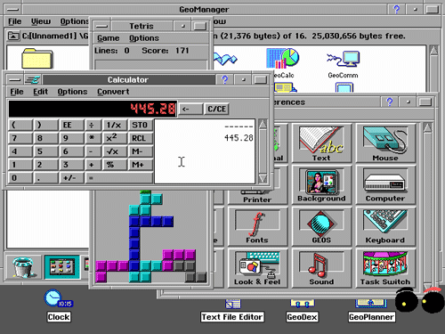
I recently fired up a version of GeoWorks on my MacBook Pro, using an installation of the emulator DosBox to pull it off. It struck me as surprising how good the code for this thing still is. It wasn't easy to install (I was flipping the switch on an empty room, essentially.) but when I got it working, I found the results impressive.

Compared to Windows 3.1, it was downright stylish—just look at this preference screen—and it deserved more of a shake than it got.

The odds against GeoWorks making a comeback are miles long, but let's hope the platform's flame gets a fresh spark one of these days.

Stop Stealing My Sign

$
0
0

Stop Stealing My Sign

Yard signs are everywhere during political campaigns, but campaign organizers don't think they actually work. So why do campaigns spend so much on them?

Today in Tedium: Today's issue of Tedium is all about politics—but not in any way you might assume. In this age of absurd analytics, Twitter nontroversies, and over-the-top digital campaigns, it seems insane that a yard sign could have any effect on most people, especially for large-scale presidential campaigns. For one thing, compared to tweets and social media platforms, such signs are not cheap. And they only show logos! There are no policy statements to be found anywhere on these signs. But they persist, and today's Tedium tries to unpack why that is. — Ernie @ Tedium


$2.95

The cost, per sign, to purchase 2,000 full-color, double-sided yard signs from the website Dirt Cheap Signs, a price that includes metal H-stakes to embed the signs into the ground. (The full cost of the sign buy is $5,900.) Purchasing yard signs is a game of scale—buying just one doesn't make a lot of sense, but buying thousands or tens of thousands is relatively cost-effective. In comparison, it costs a few hundred dollars to run a single local television ad, according to Entrepreneur. But, on the other hand, there's a lot less physical labor that goes into a televised campaign ad—you don't have to shove 2,000 printed signs into the ground.


Stop Stealing My Sign

(mlhradio/Flickr)

How a shaving cream company helped inspire the rise of the yard sign

In October of 2008, The Onion made a spot-on joke about political campaigning at John McCain's expense. The headline, "McCain Blasts Obama As Out Of Touch In Burma-Shave-Style Billboard Campaign," suggested that the Republican candidate was using road signs as anti-Obama poetry, in a style similar to the shaving company's long-running campaign, that lasted through the 1960s.

The joke—that McCain was relying on outdated marketing methods to campaign at a time when Obama was basically inventing the "big data" campaign—was worth a chuckle or ten. But hidden in the satire is a grain of truth. Burma-Shave did inspire political campaigning, because it highlighted just how effective signage could be in the right context.

The company, which had brought one of the first brushless shaving creams to the market, was struggling to reach its target audience, until Alan Odell, the son of the company's owner, one day suggested making roadside signs that advertised the company. He was given a couple of hundred dollars to try the idea out, putting the signs out in a remote part of Minnesota. Almost immediately, the sing-song ads had an effect on the company's bottom line, and for the next 40 years, Burma-Shave was a constant on major roadways.

The interstate era ultimately did Burma-Shave in, forcing a change in tactics after the company was sold off. But the campaign helped to show the value of small-scale signage, which ultimately has become a key element in modern political campaigns, Onion jokes aside.

And there's even direct evidence that Burma-Shave had a direct effect on political campaigning. In Canada, the company directly inspired a political term, "burma-shaving," which basically means that a candidate holds out one of their signs and shows off to passers-by, effectively creating a natural photo-op.

Jim Flaherty, Canada's late finance minister, once recalled during a commencement speech at the University of Western Ontario having to do this on election day in 2008.

"While I don’t know if this technique actually gets you votes, I do know that it keeps nervous candidates busy and not bothering their campaign team, the ones doing the real work," Flaherty noted in his speech.


1.7%

The increase in voter share attributed to yard signs, according to a Columbia University study. The researchers told Politico that they were surprised by the modest finding—because they assumed the study would show that the signs had no effect at all. "We were surprised by these findings, because the conventional wisdom is that lawn signs don't do much—they're supposed to be a waste of money and time. Many campaign consultants think that signs 'preach to the choir' and not much else," co-author Alex Coppock told the website. Still, 1.7 percent is not much to write home about—unless you're running a tight race.


Stop Stealing My Sign

(Phil Roeder/Flickr)

Five people who wrote letters to the editor about stolen yard signs

  1. "Campaign signs don’t vote. However, the people whose signs were stolen do vote, and do tell their friends and neighbors."
  2. "To the person or people who are stealing the Bill Brown for Commissioner yard signs from Carroll County homes, this just proves you can face the competition."
  3. "I find it sad that I have to write in to the city's newspaper to remind someone out there of this simple act of human courtesy. I just hope it helps."
  4. "Upon discovering this morning that a political yard sign was gone from our yard, I first wondered how a major network news anchor might have reported it."
  5. "The yard sign supporting the Obama/Biden ticket was stolen within 12 hours of its placement. A letter to the editor will no doubt reach a much larger audience."


Stop Stealing My Sign

Steve Grubbs, right, with Rand Paul. (Gage Skidmore/Flickr)

The guy who has changed the game for political signage

When most people think about political signs, they generally think about them in terms of the rectangular 18"x24" setup that has become the standard-bearer in yards around the country.

Steve Grubbs, however, doesn't think in those terms. The Republican political operative, who spent six years as an Iowa legislator in the '90s and was once the head of the Iowa GOP, launched a company in 1999 called VictoryStore.com, and it's treated him well ever since, earning revenue in the tens of millions during election years. To put it simply, Grubbs realized that die-cutting corrugated plastic into interesting shapes was the perfect way to create yard signs that stand out.

Grubbs, who also runs a political consulting firm, may be a strategist at heart, but as a side effect of being deep in the world of politics, he knows a lot about the processes that go into printing signs. In a 2013 YouTube clip, he explains exactly why these signs work so well for drawing attention, but also spends significant amounts of time discussing how great corrugated plastic is.

https://www.youtube.com/watch?v=6qS9eh5SQPI

"We buy corrugated plastic by the truckload," Grubbs explains in the clip. "During our busy season, we'll have two semi-truckloads of corrugated plastic come in a week."

Grubbs, who bought his old elementary school and turned it into his corporate headquarters (really), has become a master of wacky ideas, both political and non-political. One of his firm's related businesses sells massive novelty greeting cards, and ahead of political campaigns, his company often introduces new ways for candidates to get their messages across, such as life-size cutouts of people who represent certain demographics.

"If you want to talk to blue-collar voters, you buy the construction-guy cut-out," Grubbs told the Wall Street Journal in 2010.

Grubbs' power over the signage, as well as his politically convenient location, has made him something of a prominent figure in the political world. It also makes him a creative mind to be reckoned with. Just ask Rand Paul, who hired Grubbs as a consultant in 2014.

Grubbs took advantage of his wide knowledge of merchandising and used it to create a surprisingly impressive campaign store for Rand, one that included mock turtlenecks, Beats headphone skins, and Bluetooth-enabled teddy bears. At one point, it even included a mock hard drive, supposedly wiped of Hillary Clinton's emails. In an interview with Racked, Grubbs explained why Paul was putting so much energy into his store:

In a campaign store, you really have two goals. The first goal is to raise money to fund the campaign. The second goal is to use product in the store to help support the messaging from the campaign. That’s sort of where we have broken new ground. In the past, campaigns would just put up T-shirts, yard signs, and stickers. What the Rand Paul campaign decided to do was to make the store an extension of the messaging in the campaign. We don’t sell a lot of Hillary’s hard drive but it got a lot of publicity and it drove home the point about Hillary having that hard drive at home and not at the State Department.

(And in case you were wondering, Rand's store also included some of Grubbs' die-cut signs.)

Paul ultimately failed to get beyond Iowa, but it wasn't because of his merch game. That was on-point—thanks to Steve Grubbs.


"Signs are a consultant’s nightmare and a print shop’s dream. You can never have enough of them, they’re a drain on your campaign budget and your field staff (if the campaign is big enough to even have one), and they don’t do a damn thing for name ID, messaging, or [get out the vote]."

— Political consultant David Mowery, explaining his frustration with campaign signs in a blog post for Campaigns and Elections. Such signage, he argues, is ineffective in a time when campaigns have become more sophisticated and data-driven. And there's another problem, too. "Beyond their lack of effectiveness, the other issue with yard signs is that they get stolen," he adds.


In a lot of ways, political yard signs—at least at the top of the ticket—are mainly of benefit for the people who want to put them in their yards. They show allegiance to their candidate and create a discussion point for those people. (Especially when used in YouTube skits involving 1,000 Ron Paul signs.)

These days, people who support causes are more likely to change their Facebook profile photos or retweet their candidate of choice, but perhaps the best evidence that physical yard signs still have their place comes from two different approaches to the Trump campaign, both in Pennsylvania.

One couple, frustrated that their pro-Trump signs kept getting stolen, decided to build a wall around their sign to prevent its theft.

"Hey, you know, we're just protecting our freedom of speech," David Peters told WHP of the offbeat strategy.

The other strategy came about thanks to a Pittsburgh resident who decided that the Trump signs didn't really speak to him. He decided to produce his own, complete with slogans designed to annoy the locals—"Trump Likes Hunt's Ketchup," "Trump Hates Pierogies," "Trump Moved My Parking Chair."

Eric Rickin, a psychiatrist, admits he was messing with people's heads.

“I feel his whole campaign and his positions are absurd. But when you try to argue with logic, it doesn’t really work,” he told the Pittsburgh Post-Tribune.

Clearly, these folks have been reading the Burma-Shave guide to marketing.

Let's Talk Toner

$
0
0

Let's Talk Toner

The Xerox photocopier was an impressive display of technology that seemed to come out of nowhere. But it was artists who really tested the device's limits.

Today in Tedium: In an era where paper is becoming less important than ever, it feels a bit bizarre at this point to go back in time just 35 years ago, when paper was perhaps having its greatest moment of all time. We were just a few years from the desktop publishing revolution, which expanded the sheer amount of stuff one could put on a page. The 'zine movement was perhaps at its peak during this time, proving an important way to democratize content for the average person. And around this time, the copier company Xerox was perhaps at the height of its powers both culturally and within the business world as a whole. And it did it all with a heck of a lot of paper. Today, we're gonna talk about Xerox, the photocopier, and the life of paper. — Ernie @ Tedium


"Xerography had practically no foundation in previous scientific work. Chet put together a rather odd lot of phenomena, each of which was relatively obscure in itself and none of which had previously been related in anyone’s thinking. The result was the biggest thing in imaging since the coming of photography itself. Furthermore, he did it entirely without the help of a favorable scientific climate."

— Harold E. Clark, an early Xerox employee, discussing the factors that made Chester Carlson's invention of xerography—the process of dry photocopying that gave the company its name—so unique. The technique, which combined electrically-charged ink (or toner), a slight amount of heat, and a photographic process, helped to change the office environment forever. Attempting to explain this process isn't easy—just try following along with Carlson's patent—but the end result made everyone's lives easier.


Let's Talk Toner

Five ways people copied stuff before Xerox came along

  1. Carbon paper: Invented at the turn of the 19th century, the ink-and-pigment material made it easy to write on more than one sheet of paper at once, which was at one point useful. It's still around, but in very limited uses—these days, people who attempt to buy carbon paper are mocked by confused millennials.
  2. Hectographs: Gelatin, which is secretly made of meat, isn't just a good dessert food; it's actually a pretty effective medium for making copies. This process involves creating a solid blob of gelatin, writing on a sheet of paper using ink, transferring the ink directly onto the gelatin, and then transferring that same ink onto new sheets of paper by placing them on the gelatin. (Here's a video in case you're curious.) Because it's low-tech and relatively easy to make, it's still a pretty common crafting technique.
  3. Mimeographs: This system, which had the honor of having been partially invented by Thomas Edison, was one of the most popular ways to make copies before the Xerox came along. Basically, a page of text would be set up as a stencil inside of a metal drum, and users would fill the machine up with ink, then basically turn the drum to put words on the page. The result looked really good, but the process was somewhat complicated, as you had to basically create stencils out of any document you wanted to copy.
  4. Ditto machines: If you went to school in the '70s or '80s, you probably ran into paper copied using one of these devices, which often came in a purplish hue. The devices, also known as spirit duplicators, worked somewhat similarly to the spinning motion of the mimeograph, but with an added touch—alcohol. The end result didn't use ink, but it did have quite the smell. This scene in Fast Times at Ridgemont High doesn't make sense unless you're aware of what a ditto machine is.
  5. Photostat machines: Perhaps the closest thing to a modern Xerox machine, these machines relied on literally taking photographs of sheets of paper, creating negatives out of those sheets, then reprinting them. It basically combined the camera and darkroom into a single machine. The machines were large and the process relatively slow, but unlike some of the other processes listed, it wasn't destructive: Once a single negative was created, an infinite number of copies could be made. Like Xerox, Photostat became so popular that the term was genericized. Rectigraph, one of the Photostat's largest competitors, eventually formed the bones of the modern Xerox company.


1968

The first year a color photocopier hit the market—and it wasn't by Xerox. 3M beat them to the punch, launching its Color-in-Color device that year. The product required specially-coated paper to allow for the printing of photos. Xerox came out with its own rendition, the Xerox 6500, in 1973, and unlike its workhorse copiers of the era, it could only print four pages a minute. The market for color copiers struggled until the '90s.


Let's Talk Toner

Why Artists Love the Photocopier

Andy Warhol likely was the first person to think that putting his face onto a photocopier was a good idea. In 1969, the pop artist walked into the art-supply store at the School of Visual Arts in New York and saw an early Xerox-style photostat machine that printed to photographic paper.

He was friendly with the owner of the store, Donald Havenick, so he tried to see if they would let Warhol mess around with the machine. Havenick warned that the bulbs were hot, but that didn't deter either Warhol or superstar Brigid Berlin, who also got in on the photocopying fun. That led to the self-portrait of Warhol above, which has been widely imitated by people screwing around with photocopiers ever since.

“Back in 1969, after showing the piece to my wife, she said it looked like death!” Havenick told Artnet of the work in 2012. “She thought it was just too morbid to hang in our apartment—until now."

It was just one tool for Warhol, who had spent a lot of time perfecting his skills with related techniques like silkscreens, printmaking, and photography. But the fact that his first instinct upon seeing a photocopier was to shove his face into it highlights just how innovative the photocopier had the potential to become for the art world.

Within a few years of Warhol's face finding a new self-portrait strategy, the zine movement helped crystalize the importance of photocopying as a form of creativity. Punk 'zines like Sniffin' Glue gained reach and influence thanks to copying machines, which made good stand-ins for Gutenberg presses.

Let's Talk Toner

Some zines made for particularly interesting art. Destroy All Monsters, a proto-punk band out of Ann Arbor, Michigan, built its early zines out of a wide variety of different copying techniques—from mimeographs to color Xerox copies. The band, which at one point included Stooges guitarist Ron Asheton, has remained fairly influential, but in recent years, it's the band's art that's stood out, as both a subject of gallery showings and through a reprinted version of the band's zine.

Part of the reason the band's zine was so vibrant was because of the group's proximity to the University of Michigan. That helped the band keep the costs down.

"Access to Xerox and mimeograph machines came through the school; some guy we knew worked in the art department and University of Michigan store. We could work all night and we didn’t have to pay," Niagara, the band's singer, explained in a 2011 interview (NSFW).

Soon, Xeroxes would find their way to the hands of New York's art scene. Before he fully embraced painting, Jean-Michel Basquiat was selling color Xeroxes of his artwork to Andy Warhol in the early '80s. Before he embraced the world of his iconography, Keith Haring was cutting up newspapers and creating his own shocking headlines, which he would then Xerox.

https://vimeo.com/11252439

Perhaps the peak of what a Xerox machine could do came about in the early '90s, when director and visual artist Chel White created an elaborate three-minute animated short out of heaps of photocopies, a few tinted pieces of plastic, and a lot of faces.

Like retro computers nowadays, the process of photocopying in the '60s, '70s, and '80s carried an air of novelty in the art world, one that added possibilities rather than limits to what art could be.


Chester Carlson's revolutionary approach to photocopying obviously had a lot more practical uses than simply printing zines—which is why you see them, or their competitors at least, in offices everywhere around the globe.

We expect to see them in movies and TV shows, too. And Xerox has tried to accommodate toward its legacy as necessary, donating vintage copiers to shows such as Mad Men. The company's morgue is filled with old machines that tend to be put into movies and television as needed.

https://www.youtube.com/watch?v=nQGAaCSFlJI

But perhaps the most interesting Xerox product to show up in a piece of entertainment wasn't a copier, but a fax machine. In the 1968 Steve McQueen film Bullitt, there's a scene in which a group of people stand tensely around a gigantic fax machine—a Xerox Telecopier, to be specific—waiting for it to do its job.

It's ironic that the device is made by Xerox. See, a wait like that around a Photostat machine is what led Chester Carlson to invent something better.

America The Processed

$
0
0

America The Processed

One of the broadest possible geographic terms is, for now, the new name of Budweiser. Does Budweiser deserve "America," and if not, what does?

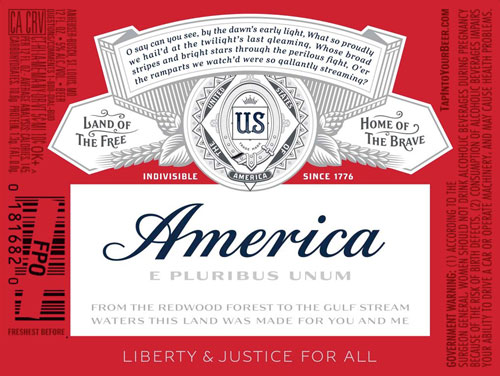
Today in Tedium: How arrogant do you have to be to name your product after an entire country, to assume that you've earned that right? On Tuesday, the no-longer-American company Anheuser-Busch InBev announced that it was temporarily changing the name of its inexplicably popular beverage Budweiser to America, ahead of the 2016 election. "It’s something that we could have not done overnight. If we’d launched Budweiser yesterday, as a new brand, we probably wouldn't have had the license to do it," Budweiser Vice President Ricardo Marques told Fast Company's design vertical. "The work of the past few decades allowed us to build this brand as a truly American brand." We're not convinced, so today, we're going to talk about things named after "America," and whether those things earned the name. — Ernie @ Tedium


"It helped us immensely that there was confusion over whether our song was really a Neil Young song. Then there was the mystery about this group from England called America. What's that all about? We had a lot of mystique."

— Dewey Bunnell, one of the three founding members of the folk-rock act America, discussing how the band's name helped drive interest in the act. The band, known "A Horse With No Name," "Ventura Highway," and "Sister Golden Hair," had an unusual starting point—the band, made up of American military brats who grew up in the U.K., essentially picked its name to prevent confusion when gigging in British pubs. Basically, they sounded American because they were actually American. But, as highlighted above, the name simply created more confusion later on. America wasn't the first band to come up with the idea of naming themselves after the country (the United States of America, a wildly experimental band that had released a single album, beat them to it by a couple of years), nor were they the last (the Presidents of the United States of America had the right demeanor for their name).


America The Processed

(Mike Mozart/Flickr)

The Canadian guy who invented American Cheese

James L. Kraft may have spent his childhood as an Ontario farm boy on the wrong side of the U.S. border, but like Ted Cruz on a presidential campaign, his legacy is purely American.

By nature of his upbringing, he had already been exposed to the process of making cheese, and as he reached adulthood, he brought this knowledge to the other side of the border, first by spending time working in a nearby Buffalo dairy.

Soon enough, he found himself in Chicago, with a couple of bucks and a deep knowledge of cheese. Starting in 1903, Kraft began to offer a service to local grocery stores. Early in the morning, he went to the city's main cheese market, tracked down the kinds of cheese grocers were likely to want, and then delivered it to stores in a horse-drawn wagon.

After doing this a while, he noticed something—specifically, how quickly the cheese would spoil in grocery stores. This was a significant problem for a number of reasons, the biggest of which was that this meant cheese didn't hold up very well in warm climates. On top of this, cheese had other problems as well–many cheeses didn't melt evenly and would essentially disintegrate when heated. That led Kraft to begin experimenting with cheese, in an effort to create something that lasted longer and was easier to use.

Meanwhile, a couple of guys in Switzerland were focused on the same problem. When experimenting with a local brand of cheese called Emmentaler Walter Gerber and Fritz Stettler figured out that by using sodium citrate on the cheese while it was melting, the cheese molecules would stick together and hold up perfectly. (This YouTube clip explains why, if you're curious.)

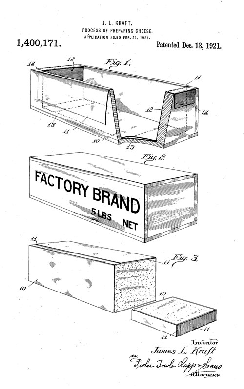
Five years later, Kraft was starting to patent some of his own strategies, which also focused on the idea of melting the cheese into a specific shape. His first such patent, filed in 1916, he filed his first such patent, for a variety of cheese that stores without quickly going bad, that melts without losing its general character.

"The chief object of the invention is to convert cheese of the Cheddar genus into such condition that it may be kept indefinitely without spoiling, under conditions which would ordinarily cause it to spoil, and to accomplish this result without substantially impairing the taste of the cheese," Kraft stated in his initial patent claim.

America The Processed

A later patent filed by Kraft gave the processed product a vessel: a box,lined with metal foil, in which the cheese product was placed into while still in liquid form, and set aside to solidify. (The result had a lot in common with the modern form of an early Kraft company acquisition, Velveeta, though unlike that semi-liquid product, the final product was solid, like traditional cheese.)

The process of making American cheese, which was effectively pasteurization, broke some key rules in terms of what cheese was supposed to be (specifically, loaded with bacteria), but it was hard to argue with the results, or the sales. Culture: The Word on Cheese's Grant Bradley put it as such:

The cheeses of yore, handcrafted in tiny batches on individual farms and later whipped up en masse in large factories, arrived at the local grocer in huge wheels (the most economical way of transporting them and keeping them fresh). James and the rest of the Kraft brothers, however, began to occupy an entirely new production paradigm. Their cheese wasn’t shaped into wheels and aged in a cave—it was a gloopy mass that was heated up, stirred in a cauldron, and removed of all bacteria. It could take on any shape.

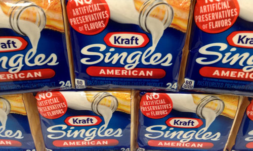
It took a few decades for the resulting American cheese to take on its most famous form, as a sliced-up sandwich utility, wrapped up in individual packets. (Kraft's brother, Norman, did much of the work on that front.) But we wouldn't have reached that point without a Canadian dude who was obsessed with cheese.

Considering how much processed food we eat, American cheese may be the most American food of all.

(By the way, it should be noted, as Mental Floss does, that "American cheese" as a term predates Kraft's invention, though it refers to a different thing—it started as a derogatory term for American-made cheddar before Kraft's invention gave it new meaning.)


1,008

The number of miles that the airship America traveled during a failed attempt to cross the Atlantic Ocean in 1910. It was the third failed effort by journalist and explorer Walter Wellman to complete a bold journey using the early aircraft. Just a few years after the Wright Brothers had invented the airplane, Wellman got the crazy idea to fly an airship over the North Pole. He made two separate attempts to cross over with the airship, but failed both times.


America The Processed

Five things that had the nerve to call themselves "America"

  1. Since 1909, Jesuits have published a weekly newsmagazine called America, a fairly influential magazine that sometimes bucks the official stances of the Catholic Church.
  2. Comedian and currently bearded human being Jon Stewart's snarkily titled America (The Book), released in 2005, went for the gut punch: "If the presidency is the head of the American body politic, Congress is its gastrointestinal tract," he wrote at one juncture.
  3. On the other end of the political spectrum, conservative commentator Dinesh D'Souza's 2014 film America: Imagine the World Without Her attempted to make the case that the country's strong history was being threatened, but D'Souza instead found himself fighting with Google over the fact that he picked a title so broad that it was difficult to find showtimes for the film.
  4. In 2012, electronic musician Dan Deacon became only the latest tunesmith to name his album America. And like Stewart and D'Souza, his reason for doing so was basically political. "I’ve never had faith in government, but like it or not I’m in this system, and if I don’t actively try to do something about it, I’m part of the problem," he told journalist Greg Kot.
  5. There are a handful of towns that call themselves "America," most notably the ghost town of America, Oklahoma. A 2013 piece in 405 Magazine reveals that the town was not named for the country, but the founder's wife, who happens to be named America.


If AB InBev were to actually register "America" as a trademark—something that legal experts don't think could actually happen—it wouldn't be the first time the "America" product mark has been registered, according to the U.S. Patent & Trade Office.

According to a search of the office's records, just 39 trademarks for the specific word exist, and most have been abandoned. One of the still-active ones is owned by Six Flags; another is owned by America magazine, the Jesuit publication I mentioned above.

But if you expand the search to basically include the word "America" as a single word in a longer phrase, suddenly the results grow to tens of thousands, with obscure brands like America's Socks and America's Favorite Flies, along with less-obscure ones like Hillary for America and, uh … "Make Amerikkka Great Again." (The latter was notable enough that it earned some news coverage this week.)

Mentioning such a broad topic like America makes people think of a lot of things, from politics, to art, to culture, and a million other things in-between. It is one of our most divisive words, in part because it means so much to so many—it brings together many, but for others, it's a symbol of unfulfilled promise.

America The Processed

Imagining one of the largest companies in the world trying to sell its most famous product as "America" invites some obvious cognitive dissonance.

Beer is great. I love beer. But is this specific beer worthy of being called "America"? I think not—it's too divisive, and raises too many questions for a country that can't even collectively decide whether to tie its shoes.

I argue that, when it comes to mass-produced items called "America," we save it for the cheese. Pretty much everyone can agree on that.

When Signal Beats Noise

$
0
0

When Signal Beats Noise

The concept of "DXing"—basically, trying to capture TV or radio signals from far away—is nearly as old as the antenna. It's a great rabbit hole.

Today in Tedium: For decades, television owners haven't been content with simply embracing the options already in front of them. There are lots of tales of this nature throughout TV history—from the people who owned (or in some cases, built) massive satellite dishes so they could pick up obscure television signals from other parts of the world, to the public-access weirdos who have long created their own kinds of television (some of whom got really lucky), to the people who got obsessed with the Amiga in the '90s. But what if you want to see what the TV or radio is like a few hundred miles away? That's where DXing comes in. Today's Tedium is about the idea of using radios and TV sets to pick up faraway signals. — Ernie @ Tedium


"Under his pillow whisper low, they creep in through his radio, that long-distance howling at the moon."

— A lyric from the 2011 Cowboy Junkies song "Late Night Radio." The song (which you can listen to here) is about how, late at night, you can receive AM radio signals from long distances away. This phenomenon, though somewhat common, is the core of the concept of DXing, and it also highlights the fact that you don't really need specialized equipment to do it—given the right conditions, a regular radio that picks up AM signals is fine, thank you very much. How, you ask? I'll leave this one to the experts: "During nighttime hours, especially during winter, old-fashioned AM radio is able to span long distances due to skywaves bouncing off the ionosphere," a guide from the New Jersey Antique Radio Club explains. "Even a simple radio is capable of hearing stations more than 500 miles away."


When Signal Beats Noise

(Nite_Owl/Flickr)

The story of DXing starts with amateur radio operators

So what the heck is DXing, anyway? Long story short, it's the idea of catching far-away signals using radio or television equipment, just to see if it can be done—something reflected by the jargony term "DX," which started as telegraph lingo for "distant reception."

The concept of DXing dates way back to the early amateur radio era in the 1920s, and in some ways, helped turn the concept of running a ham radio station into a game.

Experienced amateur radio users, especially those with a lot of equipment, compete to see how far their equipment can reach, and how many stations they can hit from a long distance away.

When Signal Beats Noise

In the pre-internet era, radio operators confirmed their contacts by sending "QSL cards" to operators who asked for them. These cards served a similar process to a stamp on a passport, or perhaps a postcard—they confirmed that a you had made a connection to a certain country or geographic area. (They're also cool as hell. This archive of QSL cards highlights just how far the phenomenon went, along with the sometimes-impressive designs of the cards.)

The 1914 launch of the American Radio Relay League further helped these ham radio operators get more formally organized, and the group eventually helped formalize DXing into a full-fledged yearly contest with rules and standards. In 1935, an ARRL employee named Clinton B. DeSoto set the ground rules of keeping score in the DXing process, figuring out a way for ham radio users to keep score of the number of "countries" they've contacted.

This was not an easy process—because, as it turned out, ham radio "countries" don't work best by treating them as countries with traditional borders, according to DeSoto. Why's that? Well, countries tend to be broken up in complicated ways. For example, if you live in Nebraska, reaching a signal in Alaska is more significant than reaching a signal in Ohio, because of the significant geographical difference.

"It is obviously incorrect to accept either geographical or political divisions alone, as immediately the most glaring inconsistencies appear," DeSoto explained in the article, originally published in QST Magazine. "The only general solution that comes anywhere near to solving the problem seems to be to reduce the definition of 'country' to the smallest common denominator—a single unit in the world's geographical and political proportions."

ARRL has since built on DeSoto's work and now runs a yearly contest called the DXCC Challenge, with prizes for the operators that hit the most "countries." There are even online vendors that sell custom QSL cards, not that they're necessarily needed, because ARRL now offers an equivalent online service that counts toward awards.

Ham radio may have been the starting point for the DXing phenomenon, but there's a lot of other spectrum out there, and that spectrum—be it shortwave, AM, FM, UHF, or VHF—each has its enthusiasts.


Five key things to understand when it comes to DXing

  1. It used to be easier to pick up DX signals. In the 1940s, the bandwidth allocated to television and FM radio signals ended up on a part of the spectrum where things spread over long distances—allowing, for example, for TV stations from Chicago to show up in Mexico, no satellite necessary. This threatened to crowd out local radio signals, so the FCC eventually changed the frequencies used, so as to prevent interference.
  2. Some signals are harder than others to pull. The reason why the subject of that Cowboy Junkies song was able to hear all those long-distance radio signals is that the AM waves are particularly attuned to long trips, partly because there's more room to tune. Shortwave, likewise, is easy to pick up from long distances. TV signals and FM signals, on the other hand? Those tend to be at parts of the spectrum that don't generally go outside of the city of origin in normal circumstances.
  3. Atmospheric conditions can boost reach. As Hack a Day notes, varying differences in the atmosphere allow for signals to jump even further from their point of origin. The most obvious example of this is at night, when tuning conditions become more favorable at long distances due to differences in ionization. But powerful signals, in some cases, bounce back from the ionosphere and can be picked up from distances more than 1,000 miles away.
  4. Location matters, too. If you want to pick up unusual TV and radio stations from different parts of the country or world, your location matters. If you're on the East Coast, for example, you're more likely to hit Africa with your AM signal, and Asia is easier to hit on the West Coast. Some DXers even encourage traveling for the purpose of picking up exotic signals—though probably not with family, because they'll get in the way of your DX pursuits.
  5. Specialized equipment helps. A true sign of a serious DXer is that they own a wacky antenna or two designed to help make it easier for them to access certain signals. They also tend to be very finicky about their tuners, which help to pinpoint a signal almost exactly, so as a result, they tend to care about higher-end equipment than the average consumer.


10,496

The number of miles between Williamstown, Australia and London—a trip that, by plane, takes roughly a full day to make. That mile count is also an approximate all-time DXing record. In 1957, onetime silent film director and star George Palmer somehow managed to pull a signal from a BBC channel from his Australian home, confirming the impressive feat by recording images and audio from the channel on his screen. Palmer, whose son grew up to be a politician, inspired other generations of DXers, including fellow Australian Todd Emslie, who pulled off a similar feat in 1981, though in that case he was only able to get the audio.


https://www.youtube.com/watch?v=Uo6V2a1tb9Y&list=PLgN_eM4h7HQO3QTAcA7cF9QC6N3u173YO

The TV DXing game is starting to get a lot more advanced

For DXers, television's last hurrah as an analog medium raised some serious questions: How is this going to change the process of DXing? Would pristine digital signals make it harder to find unusual stations? And with so many TVs offering digital channel-scanning functionality, would the heavy tweaking so often needed to bring a channel to life eventually make TV DXing impossible?

Long story short: it's still possible, but the process has evolved. Many of the basic techniques still apply, but the lack of snowy signals that barely come in and all means that the process is more complicated and time-consuming. Eric Bueneman, one blogger and DXer, has embraced the results with digital TV, even if it requires some extra work.

https://www.youtube.com/watch?v=bEDCxRHopg0

"TV DXing, as far as I've found, hasn't been that much different in the digital age than it was during the analog era. It's just that you need more patience to pull in DX," Bueneman wrote in a 2012 blog post.

One facor helping things is technology. Late last year, the Worldwide TV-FM DX Association, a group of enthusiasts, noted that automation and improved antennas have each played a key role in improving the process of finding TV stations.

"What some TV DXers are doing now is automating their DXing," the website states.

Basically, this is done through a couple of tools, including the high-end HDHomeRun TV tuners, which are to TV tuners what Netflix is to Roku. These tuners can be plugged into a site called Rabbit Ears, which keeps eyeing new listings. The result? Suddenly a time-consuming process of elimination turns into a bot, essentially.

Obvious question: Does that take all the fun out of it?


These days, DXing is pretty much a niche hobby, thanks to the internet. Most people don't have to worry about the hard work of tracking down a spare signal from a far-away TV station somewhere, because that station probably has both a website and a YouTube channel.

But at one point, DXing, while still niche, had entire publications dedicated to it. One such magazine, DX Horizons, ran for a short period in the early 1960s. It was mostly dedicated to shortwave radio, and featured the work of perhaps the nicheiest of niche journalists, Ken Boord.

When Signal Beats Noise

Boord had built a career writing and editing about shortwave radio trends, and earned a reputation for his knowledge on the topic, something highlighted by another publication he worked on, "The World At A Twirl." It was basically a bible of all things shortwave and DXing.

But it was in a column he wrote for kids in which he nailed the appeal of DXing, shockingly. In a 1954 issue of Boy's Life, he had this to say about it: "It's not only fun, but it's easy, too! With practice and patience—under normal circumstances—it's no trick at all to listen to all continents in a single evening—at times within only a few minutes!"

It's a weird, obtuse concept, this whole DXing thing. But for a certain kind of person, it's not hard to see why they might share Boord's excitement.


We All Make Mistakes

$
0
0

We All Make Mistakes

If you make a mistake today, don't fret. Everyone else around you has made a bunch, too. Errors, in a lot of ways, give us our wrinkles as human beings.

Today in Tedium: People make mistakes often. We're human. We're fallible. It's the thing that most easily proves that we're not robotic. See, if a bot makes a mistake, it's ten to one because a human programmed it incorrectly. And honestly, those errors aren't necessarily bad things. We make mistakes every day, bounce back from them and are significantly more amazing as a result. They make us more human, more creative, and allow us to test what our limits are. But errors are goddamn funny; just ask Jay Leno, who spent 20 good years sucking a single newspaper-themed gag dry. That's why we're talking all about them in today's Tedium. — Ernie @ Tedium


"Broadly speaking, when humans do simple mechanical tasks, such as typing, they make undetected errors in about 0.5% of all actions. When they do more complex logical activities, such as writing programs, the error rate rises to about 5%. These are not hard and fast numbers, because how finely one defines reported 'action' will affect the error rate. However, the logical tasks used in these studies generally had about the same scope as the creation of a formula in a spreadsheet."

— University of Hawaii Professor Raymond R. Panko, discussing the commonality of errors made by humans in his 1998 paper What We Know About Spreadsheet Errors, which he most recently updated in 2008. Panko, an information technology management professor at the school's Shidler College of Business, runs a website dedicated to the nature of human error, complete with theories on the cognitive processes that lead us to make mistakes. "Corrections are appreciated," he writes on the front page of the site.


We All Make Mistakes

When mistakes accidentally end up in the dictionary

Bad news, Scrabble fans. If you ended up using "dord" in a recent round of the game, you need to hand back those points.

However, it should be noted that you probably should update your dictionary, stat. For five years, the unusual word, claimed to be a scientific term for density, was a part of Webster's New International Dictionary.

The reason that the word showed up in the dictionary is actually pretty entertaining. One day, Webster's chemistry editor Austin M. Patterson sent a note to the book's printers noting that the word density could be abbreviated as "D or d" when used in the context of physics or chemistry. The printers misunderstood what Patterson was trying to say, and … well, they invented a new word. Oops.

After the error was discovered in 1939, Philip Gove, the editor of Merriam Webster, revealed what happened.

"As soon as someone else entered the pronunciation," Gove wrote, "dord was given the slap on the back that sent breath into its being. Whether the etymologist ever got a chance to stifle it, there is no evidence. It simply has no etymology. Thereafter, only a proofreader had final opportunity at the word, but as the proof passed under his scrutiny he was at the moment not so alert and suspicious as usual."

The fun part about all this is that dord arguably should be in the dictionary—just not as a synonym for density. See, "dord" is actually the name of an ancient musical instrument in Ireland, a giant horn best compared to the modern didgeridoo. It dates back to the Bronze Age. (In case you think I'm BSing you, here's a video of a guy playing the instrument in his kitchen.)

Sounds like someone made a mistake.


$12.7M

The amount that an errant "s" on a liquidation notice cost the U.K. government, after Companies House, a federal agency, accidentally announced the liquidation of "Taylor & Sons," rather than "Taylor & Son." The former firm was admittedly struggling at the time, but was holding on. But the announcement actually turned into a self-fulfilling prophecy, leading to the firm's shutdown not long after, leading to the layoff of 250 employees. The owners of the company sued—and won.


We All Make Mistakes

(via Buzzfeed)

Why we're happier with things we do ourselves, even when we do them incorrectly

Ten to one, there's probably a piece of furniture in your house or apartment that feels a little loose. On the surface, it looks fine, but it's not fully put together … maybe a screw's missing, or you had an unexplained missing part after the fact.

It translates a lot of other places, as well. Say you paint something or put a lot of work into a weekend project. The result may not be technically good, but you personally appreciate the effort you put into it, and see it through the prism of the fact that you made it, and therefore, it's awesome.

Turns out, there's actually a term for this phenomenon. It's called the IKEA Effect, a form of cognitive bias that has gained a bit of currency over the past few years. The idea was first brought about by a trio of professors—Harvard's Michael I. Norton, Tulane's Daniel Mochon, and Duke's Dan Ariely—who published their findings in the Journal of Consumer Psychology in 2012.

The abstract of the research paper nails the basic issue at hand:

In a series of studies in which consumers assembled IKEA boxes, folded origami, and built sets of Legos, we demonstrate and investigate the boundary conditions for what we term the—"IKEA effect"—the increase in valuation of self-made products. Participants saw their amateurish creations—of both utilitarian and hedonic products—as similar in value to the creations of experts, and expected others to share their opinions. Our account suggests that labor leads to increased valuation only when labor results in successful completion of tasks; thus when participants built and then destroyed their creations, or failed to complete them, the IKEA effect dissipated.

The result is that we like and may even defend the final result of what we were working on, despite the inherent flaws and inconsistencies we may be baking into the process along the way.

So, if you're making a poster and don't really have any experience with design for example, you may not be aware of what kerning is and why it's a beneficial part of designing something reliant on typography. But a designer? They can spot it from a while away, and they realize that (in their line of work, at least) it's an error.

If that designer goes up to the person who made the poster and tells them, hey, your kerning looks janky, they might get upset with you, even though the result is technically an "error" or a "mistake." Because, ultimately, when it's our work, we appreciate the final result more.

In a TEDx talk Ariely gave, he admitted that "mistakes" ultimately gave the IKEA pieces he built their charm.

"I can't say I enjoy those pieces. I can't say I enjoy the process," he told the audience. "But when I finish it, I seem to like those IKEA pieces of furniture more than I like other ones."


"Literally for hundreds of years, we have been promising readers when we make an error we correct it. That's how it works with newspapers. … Then all of a sudden because it's easy to scrub something away, we are abandoning what we've been doing for hundreds of years. It's really shameful. It seems to make journalists and editors forget this standard that we've had for such a long time."

— Craig Silverman, the founder of the news blog Regret the Error, which is now owned by the Poynter Institute, speaking about the importance of correcting errors in a 2010 interview with the American Copy Editors Society. Silverman, who now works as an editor for BuzzFeed, has become something of a key figure on the importance of corrections, something he believes is getting more important in the viral news era.


https://www.youtube.com/watch?v=Zoqky3GoFCQ

As I think I've said before, my favorite movie is The Room. It probably always will be. It's perfection on celluloid.

But the thing that makes it perfect is that the fact that it is so raggedly, horribly, awkwardly human—the work of Tommy Wiseau, a man impossibly out of his depth as a filmmaker, actor, and writer. And as a result, it's full of errors, large and small—more than a lot of films of its ilk.

The IMDB page is, as a result, one of the funniest pages on the site, because it shows the depths of the film's failings.

At one point, Wiseau's character, Johnny, makes a claim that when he first got to San Francisco, that he couldn't cash a check because it was from out-of-state—which, as the IMDB page notes, is something that you can, in fact, do, and something Johnny should know, because he works at a bank.

There were other major plotting errors (dialogue in a pivotal early scene makes reference to nonexistent candles and music), along with problems with the set (characters on the second floor have to first climb up stairs before going down a spiral staircase), continuity in filming (watch this YouTube clip), and problems with the casting (there's a "Barista #2" listed in the credits, despite the fact that there is no "Barista #1"). The movie is perhaps littered with more errors than any other movie of its ilk, cult audience or not.

But without those errors all over the place, the film would not have any of the ramshackle charm that makes it worth going back to.

Don't tell your grammar school teacher this, but errors are the spice of life. Well, at least in some contexts.

Bizarre String Theories

$
0
0

Bizarre String Theories

Most guitarists don't tend to think it's a good idea to put foreign objects on their prized rock instruments. But some do, and they make the craziest music.

Today in Tedium: Of the many fascinating experiments on the internet these days involving red hot nickel balls, my personal favorite is this one, involving two guitars. This clip, apparently inspired by nickel-ball innovator Matthew Neuland's uncle, at first attempted to show whether a fiery nickel ball would put the guitar out of tune. Then Neuland used the nickel ball to destroy the strings. It's far from the first example of someone messing with guitar strings just to see what might happen—in fact, there's something of a whole subgenre of guitar playing based on the concept of modifying or breaking guitars in unusual ways. Today, we dig into the surprising beauty of prepared guitars. — Ernie @ Tedium


"I was sort of working on an art project. I had my guitar with me and a lot of materials were scattered around. It was that peanut-butter-and-chocolate moment, where these two things came together."

— Experimental guitarist Janet Feder, discussing with Premier Guitar how she fell into the process of preparing her instruments, by putting different objects onto the strings to see how they would change the tenor of the sound the device would make. At the time Feder came up with the idea roughly two decades ago, she wasn't aware of many other people doing the same thing, although plenty of experimenters were out there. Since then, she's pretty much owned the approach—check out her performance of "I Hear Voices" to get an idea of how the tiny objects she puts on the guitar help to give her songs additional texture and percussion.


https://www.youtube.com/watch?v=ZLognMTncvY

Five kinds of objects used to prepare a guitar

  1. Alligator clips: Perhaps the most common kind of object used to prepare a guitar, these tiny clips fit efficiently around guitar strings, making them a natural way to modify the sound of the guitar without adding a lot of extra heft. On acoustic guitars, they create percussion; on electrics, they add feedback.
  2. Violin bows: This is probably the one most people are familiar with, because Jimmy Page popularized it during his time with Led Zeppelin. Bows are also popular among guitar preparers, in part because they sustain a note for a long period of time. The EBow, a battery-powered electronic device introduced in the 1970s, basically does the same thing as a traditional bow might.
  3. Twine or hair. On an electric guitar in particular, these create something of a dragging effect on the strings, sort of a ragged version of what you might get if you're using a bow. (This clip shows a guy using both twine and a bow. Compare and contrast.) Feder in particular is a fan of using horsehair on her guitars.
  4. Screwdrivers or metal rods. One popular technique among some experimental guitar players is something called the "third bridge," which basically involves putting a metal rod in the middle of the guitar, which basically splits the neck into two separate guitars. Sonic Youth and their early mentor, Glenn Branca, were big on this technique—here's a clip of the band's Lee Ronaldo using it to his musical advantage.
  5. Split rings: Another one of Feder's preferred tools, these are basically the tiny coils you use to loop keys onto a keychain, but the really small versions you've most likely seen on a Swiss army knife. "What it creates here is more like a spectrum of sound," Feder told NPR of the tool. "It has a lot of low tone and high tone to it at the same time, like a bell does."


Bizarre String Theories

The album with the terrible cover that redefined how the guitar could be played

In the history of music, never has an album cover and title been such a poor match to the music contained within than the avant noises found on Guitar Solos, Fred Frith's first solo album, released in 1974.

A record that basically laughs in the face of convention, it essentially features Frith improvising using a set of heavily prepared guitars, discovering and modifying the sounds being made by the devices using an array of volume pedals.

He added pickups to the necks of the guitars he was playing, threw capos onto the middle of the neck, and effectively turned the devices into two different guitars each, rather than just one. And he would play both guitars at the same time, of course.

The album as a whole is a challenging but rewarding listen, with the beautiful drones on the intro to the album's closer, "No Birds," proving that accessibility can be had in the midst of free improvisation.

This kind of material has been mined numerous times since–British electronic act Fuck Buttons, for example, was taking notes when it mined beauty from discord, as "No Birds" does so effectively—but Frith did it with just a couple of creatively prepared guitars.

In an interview with documentarian Steve Elkins, Frith said that the recording came about after Virgin Records, the label at the time for his band Henry Cow, got the idea that Frith should record a solo album. Rather than making a record to highlight his ability to play guitar solos, he got the idea to basically see if he could redefine the instrument's parameters entirely.

"They thought that rock guitar players should make solo records, because it's 'cool,'" Frith said. "But they had no idea what they were getting into in my case. "

The approach led him to basically start playing guitar in ways that actively avoided the traditional dynamic of the instrument:

One of the things I did for that record, was I laid two guitars flat on the ground, with their necks coming from opposite directions. So I had these two necks, which were basically like keyboards, and I started preparing them. I'd seen David Toop, who opened for Henry Cow at a concert in 1971, using alligator clips on his guitar. That led me into a whole thing about, if the alligator clip could produce a sound out of an electric guitar which sounds like a gong, then there must be all kinds of things you can do to a guitar, which are going to do comparably interesting things. So I started to try out everything. I used sticks, bits of glass, metal, springs, chains, and all the things which have become a part of my vocabulary ever since. Dropping things on the guitars came later.

https://www.youtube.com/watch?v=skd_70BINEQ

Frith's experiments since have helped to expand the possibilities of what exactly a guitar can sound like, and have since inspired generations of players—even if they didn't end up going the free-improvisation route that he did. A 2007 clip of Frith offering lessons on how to use prepared elements on a guitar is amazing in the depth of his knowledge. At one point he uses a paintbrush (!) to sustain a note on the guitar.

It's worth noting that this free improvisation strategy can quickly go wrong in the wrong hands—Lou Reed's infamous Metal Machine Music, which didn't use prepared guitars but basically was just an excuse for Reed to create music from noisy feedback for an hour, is widely considered one of the worst albums ever made. (That said, it has received some critical reassessments of late.)

But Frith used the launching pad from Guitar Solos to build a decades-long career in experimental music that's included documentaries on his life, collaborations with John Zorn, and a body of work that has never compromised in the name of commercial interest.

Impressive work, considering such an unassuming album cover.


$788

The amount Glenn Branca, a famed no-wave guitarist, sold a double-bodied "harmonics" guitar for on eBay last year. "Double-bodied," you say? Yes. For more than three decades, Branca has been custom-making electric guitars that feature a single neck, but two guitar bodies. Why would one do this? Well, according to Branca, the result, while impossible to play as a traditional guitar, creates richer harmonics effects. "The guitar facing away from your body plays mainly just harmonics. The one against the body sounds the same as a slide guitar," he explains in the eBay listing. "You can use either one or both guitars balancing them the way you want. When using 2 amps you can get an extreme stereo guitar effect. The fret positions do not correspond to the pitches since the strings are longer than usual. The guitar can only be played with a slide bar." (And in case you're wondering: Yes, there is video of him playing this specific guitar.)


In an age when we expect our music to be three to five minutes long, to have a catchy chorus, and to tell a complete, relatable story in that timeframe, it's likely impossible that we'll ever see prepared guitarists along the lines of Fred Frith gain a wide audience. Sonic Youth is probably the closest we'll ever get to seeing it go mainstream.

https://www.youtube.com/watch?v=866w1wli734

Still, there are plenty of artists out there trying ambitious, experimental things. Bill Horist, a Seattle-based musical improviser who uses guitar preparation to build impressive soundscapes, uses all sorts of crazy tools, including all of the ones we mentioned above, along with things like drum cymbals. (Here he is in action.)

"Being a lefty who plays guitar right-handed, I'm predisposed to different dominances in my approach. Preparing the guitar enables me to play with these reversals," Horist told The Stranger in 2004.

Janet Feder's playing isn't outside the realm of traditional possibility—it's experimental but not to the point where it makes the songs unpalatable to mainstream ears, and as a result she's gotten to play on NPR's tiny stage. But what do you do with someone like Bill Horist?

You attempt to put him on America's Got Talent, apparently. On his website, Horist offers up a lengthy blog post describing how he was talked into doing the show in 2013, despite the fact that he had "checked out of mainstream entertainment and society back in 1983 as an incipient punk."

The process was lengthy, and the final result was just as frustrating as you would imagine—required to throw out his lengthy composition strategy, he instead created something that the judges and the audience could listen to, ponder, and decide to hate in just 90 seconds.

And after all that … of course, the judges hated it. He pissed off Heidi Klum. Howard Stern thought he was a teenager. And ultimately, the effort proved somewhat for naught, as it doesn't appear to have actually aired on the show.

Horist appears to believe the format was ill-suited for his work:

There was consensus among my family that I was set up from the beginning. I believe it is possible but I also believe that the judges just didn’t get it. 90 seconds is an incredibly short time in which to absorb what I’m doing and how I use objects to create strange unguitar-like sounds. When one is doing such strange and unfamiliar things to an instrument, it takes a few minutes for the uninitiated to connect the dots between what is seen and heard.

And ultimately, he's probably right. Sounds like he needs to get in the red hot nickel ball business.

The Ballad of Yo! Noid

$
0
0

The Ballad of Yo! Noid

In the '80s and '90s, advertisers got the idea to market products to kids through video games. The games aren't half-bad (mostly), but they're still ads.

Today in Tedium: Here's a challenge for you: Take your favorite video game of the '90s and don't think about it in terms of the quality of the game, its graphical quality, or its replayability—especially if it's a game based on an existing license. Instead, think of that game in terms of it merely being a vessel to market another product: say, a movie like Terminator 2, a toy like a Barbie doll, or a musical act like Aerosmith. How strong of an impression does that game create on you as a player? Does it inspire you to go to to an Aerosmith show or buy a new Ken doll? This strategy was actually pretty common in the video game space during the '90s, and that meant there were a lot of games clearly designed to ultimately sell another product—including for pizza, soda, and McDonald's. (And in the case of the arcade classic Tapper, even beer.) The games weren't terrible, and in some cases they were acclaimed. But they represented a new type of marketing that could potentially hold dividends far beyond a Blockbuster night. Today's Tedium discusses why that is. — Ernie @ Tedium


"Raisins may not have been the best game ever made, but I think fondly of it. For the most part, three of us put it together over the course of four or five months. Given what we were doing and what little resources we had, I think we did a fairly decent job."

— Video game programmer Robert Morgan, discussing his work on California Raisins: The Grape Escape, an NES game that he was a primary developer for. The game, which was to be released by Capcom, was prominent enough that it showed up on the cover of Game Player's magazine in 1991. Despite this, the game was never released and has since earned a reputation as being one of the best unreleased games in the console's history. Morgan isn't sure why. "Why was the game never released? I honestly don’t know. As far as I know, the game was complete and ready to go," Morgan told Lost Levels. "Some people have had [conspiratorial] theories that someone may not have wanted the game released—it’s fun to think that, but it’s probably more likely that it was a marketing or company politics thing. The truth is that I was too far from the decision-making to be privy to what went on. I understand that the game did have some healthy pre-orders from the retailers …"


The Ballad of Yo! Noid

Did the rise of commercial mascot video games come in response to federal regulations?

As you may or may not know, the federal government arguably killed Saturday morning cartoons, due to rules in the Children's Television Act of 1990 that required a certain amount of educational programming to be played on broadcast television.

The law also played a key role in changing the nature of advertising around children's programming on broadcast TV, by limiting how much advertising could be programmed around educational programming. On top of requiring new educational standards for the programming itself, just 10.5 minutes of ads per hour could be played around a given cartoon on Saturday mornings, and just 12 minutes per hour on weekdays.

That meant the ads targeted at children ultimately had to be shorter and as a result would have less impact in the long run. Cable television hadn't completely taken over yet, but video games—which faced few of these regulations—were a great way to work around the limitations of marketing to kids.

Television advertising targeted at kids has long been a target of federal scrutiny. For example, the Carter administration's imprint on the Federal Trade Commission in the '70s was notable for the hard-line stances FTC Chair Michael Pertschuk took on the issue.

"Many children have only a minimal understanding of what TV commercials are and what they do," Pertschuk told People magazine in 1979, back when People covered legitimate news. "Advertisers seize on the child's trust and exploit it as a weakness for their gain."

Pertschuk's stances ultimately led to a showdown with Congress, one that led the FTC to temporarily shut its doors in 1980 due to a lack of funding.

Many of the FTC's stricter regulations on advertising to children came later, with 1998's Children's Online Privacy Protection Act perhaps being the strongest regulation targeted. The timing of the Children's Television Act, which passed in October 1990 at the height of the NES era, certainly made video games an appealing path forward for marketers. Video games, even simple ones, are more immersive than any 30-second commercial could hope to be. If you spend an afternoon playing Yo! Noid, odds are a little bit higher that you're gonna bug your mom for pizza come dinner time.

The fact that such games sold for $50 a pop in 1990 money certainly helped matters as well. Even a game rental could pay dividends down the road.

So it makes sense, then, that some of the most prominent licensed video games showed up not long after the passage of the Children's Television Act of 1990. Turning a mascot designed to sell a product into a product of its own is a clever way to get around federal advertising regulations.


5.7M

The number of copies of Chex Quest, a first-person shooter that relied on the Doom engine, that Ralston Foods gave away in 1997 on boxes of its namesake cereal, Chex. The developer of the game, Digital Café, had a budget of half a million dollars, and the end result was arguably good enough to sell in stores. But they gave it away for free, because giving away a free video game on a CD-ROM was awesome marketing in 1997.


https://www.youtube.com/watch?v=2F5LxvSoz2c

Five dirty little secrets of video games based on commercial mascots

1. The games are often based on other, unrelated games from different countries. Yo! Noid, the pizza-themed platformer that came out in the U.S. in November of 1990, wasn't an original title programmed strictly for the American market. It was actually a reworked version of Kamen no Ninja Hanamaru, a Japan-only release by Capcom.

How similar were they? This YouTube video shows that while the graphics were updated for the American market, the gameplay was not.

(As weird as a video game based on a pizza-eating mascot is, it's not the weirdest thing to ever happen to The Noid—this bizarre kidnapping incident is.)

The Ballad of Yo! Noid

2. The U.S. edition of Super Mario Bros. 2 was a repurposed mascot game. The story behind the second Super Mario Bros. game in the U.S. is one of modest deception on the part of Nintendo of America, which believed that the Japanese version of the game was too hard and didn't live up to the standards of its biggest hit.

Fortunately, there was another Mario-style game in Japan that had a license that was difficult to translate to the American market. That game, Yume Kōjō: Doki Doki Panic, was created at the behest of Fuji Television to give an extra push to Yume Kōjō '87, a heavily promoted two-week festival designed to play up the network's upcoming programs. (It's sort of like NBC creating a Must See TV video game just to promote the premiere of Mad About You, if you think about it.)

So, when Nintendo of America rejected the original Mario sequel, Nintendo fortunately had a Japanese game in the can, in which it could reuse everything except what it didn't actually want—the mascots. The Gaming Historian has a great clip discussing the story behind the bait-and-switch.

The Ballad of Yo! Noid

3. McDonald's fought really hard to win over gamers. Between 1988 and 1994, at least five different video games with Ronald McDonald branding were released worldwide. All were different stripes of two-dimensional platformers.

The most well-known of these efforts was the 1992 game M.C. Kids, a Super Mario Bros. 3-style game that was released on six different platforms, most notably the NES. (The name may have come from the McDonald's-themed clothing line that Sears was selling for a time. Would you dress your kids up in this stuff?)

https://www.youtube.com/watch?v=EzLtc_r6f6U

But the most interesting, in some ways, is the first one: Donald Land, a Japan-only game for the Famicom, was clearly an effort to turn Donald McDonald (as he's called in Japan due to the lack of hard "R" sounds in the Japanese language) into the next Mario. It didn't work in any way, shape, or form, and kind of made Donald look like a terrorist. A man dressed in a onesie, wearing clown makeup, and lobbing bombs at everything? Sounds like the Unabomber to me.

The Ballad of Yo! Noid

4. A cool video game is a great way to get free promotion. We see ads everywhere—on TV, on billboards, in bus stations—with one exception. That one place is the cover of a magazine, because, ultimately, magazine covers are ultimately meant to highlight editorial stories, not promote ads. It's a church and state thing.

But there's a funny thing about turning mascots into games: If they were good enough, they could show up on magazine covers, which is sort of a clever way to turn what's essentially advertising into a form of editorial content.

For example, the well-reviewed 7UP-themed game Cool Spot, which had versions for nearly every major gaming platform in the early '90s, showed up on the cover of the Sega magazine Megazone. Not to be outdone, Chester Cheetah made an appearance on the covers of both GamePro and Game Informer. Even if most consumers aren't even looking for a video game magazine, they show up within shouting distance of Newsweek and Sports Illustrated, thereby making them a great way to advertise one last time to people already in a store that sells both 7UP and Cheetos before they spend their afternoons playing M.C. Kids.

(I'm sure Joe Camel was booting up his Genesis development kit before the federal government decided to rein in cigarette advertising altogether.)

The Ballad of Yo! Noid

5. Sometimes, mascot games get recycled by multiple brands. Virgin Interactive, the Richard Branson-affiliated game developer, was responsible for both M.C. Kids and Cool Spot, which put the company in unusual situation with the Game Boy version of M.C. Kids, which was published as McDonaldland in Europe, but was redone with the 7UP branding outside of Europe. (The potential reason for this? Spot wasn't known as the 7UP mascot in Europe; Fido Dido was.)

The Ballad of Yo! Noid

Yes, that means there's a Game Boy game out there that is affiliated with not one, but two different commercial mascots.


As video games evolved into something that was closer to an artform than something that could be used as a way to promote something else, the concept of games based on mascots never really went away—they simply evolved into Flash games, like this Honey Nut Cheerios Angry Birds clone on the Cartoon Network website, or even mobile games.

But as games got smaller in physical and became things that could be distributed with other products, along the lines of Chex Quest, it led to new ways of using games to promote stuff.

A good example of this came about in 2001, when McDonald's teamed with Sony to distribute Playstation II games to Japanese McDonald's customers for free. The "Happy Disc," as it was called, included early versions of Parappa the Rapper 2 and the Japan-only game Piposaru 2001. In 2006, Wired described the game as one of the rarest ever released for the console, due to the fact it could only be won as a prize in a Monopoly Game-style contest.

The games, while keeping the original characters and gameplay, are loaded with a ton of extra graphics of golden arches and hamburgers.

If you can't beat 'em, shower them with your branding, apparently.

Hot Pocket Diaspora

$
0
0

Hot Pocket Diaspora

Jim Gaffigan jokes aside, Hot Pockets made a family of expat Iranian Jews into billionaires—billionaires who have jumped into philanthropy with both feet.

Today in Tedium: Laugh all you want, but Hot Pockets are the ultimate modern food. Designed to be incredibly easy to eat and simple to cook, they cleverly were designed to be easy to microwave and completely, utterly portable. Less known about the Hot Pocket, however, is its origins, which are the product of a duo of Iranian-born Jewish immigrants who arguably popularized the concept of microwavable frozen meals. Jim Gaffigan hates these things, but we admit something of a respect for them as a bottom-up success story (that just happens to be incredibly unhealthy). Today's Tedium discusses the surprising cultural implications of the Hot Pocket. — Ernie @ Tedium


320

The number of calories in a single Pepperoni Pizza Hot Pocket. The products include a significant amount of fat (15 grams), saturated fat (6 grams), sodium (700 miligrams), and uh, calcium (20 percent of a recommended daily value). The Hot Pockets website recommends that you "enjoy your Hot Pockets with a side of fruit or vegetables," a piece of advice we're sure millions of people ignore on a daily basis.


Hot Pocket Diaspora

(Ralph Daily/Flickr)

How a Belgian waffle manufacturer brought the Hot Pocket to life

Before it created the miniature calzones that represent their biggest gift to popular culture, Chef America got its start with Belgian waffles. In a patent filed in 1977 and approved in 1983, the company noted that it had figured out a way to take the guesswork out of a breakfast product that was incredibly difficult to make—and it did so, by making it ahead of time, freezing it, and then making it easy to microwave.

"Although there have been many attempts to do so, Belgian waffles are not utilized in restaurants except in some rare specialty houses, because of the difficulty in making the batter and maintaining its freshness as well as in properly cooking the same," the filing stated.

It was actually pretty innovative and probably made brunches a lot less painful for many restaurants, but it was nothing compared to what was to come.

Chef America's start in the late '70s came at a time when it was unclear whether the microwave would take over the U.S. market in the same way the television, a similarly rectangular device with dynamic-changing ramifications, had. According to the Bureau of Labor Statistics, just 1 percent of American households owned a microwave in 1971, and by their estimates, the number had barely improved to just over 10 percent of households by the late 1970s. But Chef America came around during a tipping point, where the creation of dedicated microwaveable food could have an impact on the appliances we buy.

It took a little while for the Colorado-based company to perfect its approach, however. Those Belgian waffles may have proved a good starting point for the company, but they weren't conversation-starters that could be sold in commercials. Fortunately, the company was willing to experiment, and those experiments led to something totally unique.

Hot Pocket Diaspora

(Mike Mozart/Flickr)

Launched in 1980 as Tastywich, the product that became known as the Hot Pocket was the brainchild of two brothers, Paul and David Merage. At the time the duo formed the company in 1977, Paul had existing retail experience, having spent time with Maxwell House and Hunt Wesson as a marketer.

During his time as a marketer, Paul pondered the trend of two working parents, along with the tendency of people to graze, and the growing desire for portable foods. Hot Pockets, as a marketing strategy, effectively combined these three concerns into a single hand-held product.

It wasn't easy, though. See, microwaves aren't perfect, and what works for a Belgian waffle doesn't work for crispy bread. In fact, the Merage brothers struggled to perfect the formula of the bread to ensure it didn't have the texture of either cardboard or rubber. (When they did, they patented the hell out of it, of course.)

Hot Pocket Diaspora

(Wikimedia Commons)

The secret to ensuring a crispy bite is in the Hot Pocket's sleeve. The gray surface in the innards of that sleeve is a plasticky metal film called a susceptor. This film basically takes the waves being pushed out by your science oven and captures them, turning the entire sleeve into a tiny broiler, heating up the frozen foodstuff in a couple of minutes, and ensuring that the pocket is heated somewhat consistently.

(Well, somewhat. It often is burning hot on the outsides and cold in the middle, as Jim Gaffigan would tell you.)

Belgian waffles helped Chef America get into restaurants, but it was the rebranded Hot Pocket, which launched in restaurants in 1983 and later made the move to retail outlets, that made the Merage brothers rich.

By 2002, after the company had launched numerous variations on the original idea, Nestlé was knocking on Chef America's door, and the Merage brothers answered the call—agreeing to a buyout worth $2.6 billion, one that made the brothers rich beyond their wildest dreams.

Paul Merage, who served as Chef America's CEO, had big plans to give that money away.

"We've been given the opportunity to really share in the American dream," he told The Wall Street Journal in 2002. "We need to give back."


"I used to tell students he is a role model for what a business CEO should be, and if they have a cynicism based on what they're hearing about the Enrons and the Tycos, Paul Merage is the perfect antidote. He's a man of impeccable integrity."

— Marshall Kaplan, the onetime dean of the University of Colorado's Graduate School of Public Affairs, discussing with the Los Angeles Times his respect for Paul Merage. After selling his company to Nestle, Merage brought in Kaplan to run his charitable foundations. Merage had such an effect on Kaplan that, at the age of 68, he left his tenured position at the University of Colorado to help Merage give away his money to worthy philanthropic causes.


Hot Pocket Diaspora

Merage Jewish Community Center of Orange County. (via LPA, Inc.)

How Hot Pockets helped fund efforts to keep Jewish culture thriving in Southern California

The Merage family is currently the 139th-richest family in the United States, according to Forbes, and that wealth has helped the family become major philanthropic figures. Much of that philanthropic interest has gone back into the culture that they left behind before inventing the Hot Pocket.

Not long after selling his company, Paul Merage made his way to Southern California, where a sizable population of Persian Jews moved during the time of the Iranian Revolution in the late 1970s. It was a good fit for Merage; he left Iran for the United States while Mohammad Reza Shah Pahlavi was still in charge, but much like the roughly 50,000 Persian Jews who came to Southern California after the Shah was removed from power, he was separated from his homeland. This phenomenon is called a diaspora, and it's something closely associated with Jewish culture.

Paul's move to Orange County actually caught the Jewish community off-guard, to a degree. When the Merage Jewish Community Center of Orange County opened in Irvine in 2004, some of the names on the donor lists—Andre and Katherine Merage, the parents of the Hot Pocket inventors—were unfamiliar to the locals.

While the couple may have been an unknown to the the local Jewish community, they played an important role in their center's creation. It was Andre (who died in 2001 before the completion of the community center), who put Paul on the plane from Tehran to the United States as a teenager in the late '50s, a move that proved fateful for the family.

The campus is named for Anaheim Ducks owner Henry Samueli, but the community center located on that campus where everyone goes is named for the Merage family. And it was Paul who was the driving force for that strategy.

"Paul is very thoughtful and has a well-defined strategy for his philanthropy," noted Ralph Stern, who chaired the committee that built the community center, in comments to the Jewish Journal in 2004.

The strategy is one that Paul has followed through on ever since the sale of Chef America went through. He's associated with the Merage Institute, a nonprofit that's meant to encourage economic growth between Israel and the United States.

"I knew that I wanted to do something meaningful," he said in an interview with the PARSA Community Foundation. "And the way my mind works, which is how it was in business, I felt that if I could do something that was unique, it would be better than just doing what everybody else was doing."

Not to be outdone, David's side of the Merage family is associated with three generations of charitable foundations.

"Our philanthropic investments are focused on social change and result in children, families and communities improving the quality and circumstances of their lives," the Merage Foundations website states. "The Merage legacy demonstrates a strong commitment to their communities, their Jewish heritage, and their family."

Now, keep in mind, when reading about this, the really crazy thing about this whole state of affairs: Hot Pockets did this. It set the stage for the Merage brothers to spend the second halves of their lives donating money and time to causes they deemed important.

Hot Pocket Diaspora

RedLine art gallery in Denver. (via RedLine's Facebook page)

It allowed Paul Merage to donate $30 million to the University of California Irvine, where the graduate business school is now named after him. It allowed David Merage's wife, Laura, to open a major art center in the Denver area. And it allowed the Merage Foundation to take steps that ensure that Iranian Jews, few of whom actually still live in Iran, had their culture properly represented in Israel and elsewhere.

It's a fascinating philanthropic role to play, and it's something that Hot Pockets made possible.


When Nestlé inevitably moved the Hot Pockets headquarters from its longtime Colorado home base a few years ago, the local alt-weekly couldn't even be bothered to snark at the news, Gaffigan-style. The product's benefit to the community was just too hard to ignore.

"While Colorado is losing jobs, a corporate headquarters, and its Hot Pockets claim to fame, at least the invention has left a warm legacy in Denver," Westword cofounder and editor Patricia Calhoun wrote in 2012 blog post, which does not mention Jim Gaffigan's name once.

And if Calhoun or someone else did make the joke, it'd be understandable. Hot Pockets aren't a perfect food. When people talk about how awful and preservative-laden frozen food is, they're usually thinking about Hot Pockets. (Nestlé is trying, though.) Its ingredient list is long and scary, and it has been the subject of embarrassing recalls in recent years. It is not healthy, but it is fairly cheap.

As a piece of nutrition, you most certainly could do better. But as a cultural product, a piece of nostalgia, and a way for a family to make a couple billion dollars, I'm willing to give it a pass. It may have ruined our diets, but it's helped inspire a lot of good.

Let 'Er Rip

$
0
0
Let 'Er Rip

Today in Tedium: Last week, there was a tag on an item on my clothing that was so uncomfortable that there was nothing I wanted to do more than pull it off—to send that miserable tag to a recycling bin where it would never again see the light of day. But that annoying tag got me to thinking: Where did clothing tags come from, and who decided that an annoying tag was an important thing to have on a piece of clothing? What laws are there that lead to these tags being everywhere, and what value do they serve? Because I'm the only person who would think to ask such a question (and because I know you're suddenly curious), today's Tedium is about textile tags. You might want to put this one on the delicate cycle. — Ernie @ Tedium


Let 'Er Rip

(Kheel Center/Flickr)

The roots of modern clothing labels start with unions

If you pick up a standard piece of clothing from J.C. Penney—say, a pair of Levi's, or a plaid shirt, you're likely to notice a few things about the clothing item. Generally, the wearable will have a handful of tags hidden somewhere, including one that prominently features the logo of the company.

But before we became obsessed with brands, labels generally had another source: It was a way for labor unions to show their strength.

At the turn of the 20th century, union labels were used by a variety of labor groups, both inside and outside of unions. In fact, the first example of such labels came from cigar-makers in 1874, who used it as a way to highlight the higher product quality compared with products made elsewhere.

https://www.youtube.com/watch?v=7Lg4gGk53iY

But the most famous use of this tactic came from clothing-makers, particularly the International Ladies Garment Workers' Union (ILGWU), which used the tags almost as a branding strategy for the union. In fact, the union became noted in the '70s and early '80s for its television commercials, in which members of the union sing a ditty called "Look for the Union Label."

The campaign came at a not-so-great time for labor unions focused on clothing. In 1976, clothing items produced by unions fell in sales by more than 500 million items, according to Cornell University. That same year, the Amalgamated Clothing Workers of America, a union for makers of mostly men's clothing and another major union label advocate, folded into another group, starting a long-running phenomenon of mergers in the domestic garment union space, one that eventually sucked ILGWU into the mix as well.

Nowadays, as we can barely even be convinced to wear "Made in the USA" clothing, let alone union-branded clothes, the union labels have taken on a different role: They've become tells for vintage clothing enthusiasts to figure out exactly when a jacket or shirt was manufactured, give or take a few years.

It's weird to think that the way we can tell a shirt isn't that old is by proving that said shirt didn't have the power of a union backing the employees who made it.


"Well, I lost my temper, and I took a knife and I, uh … do you know those 'do not remove under the penalty of law' labels they put on mattresses? … Well, I cut one of them off!"

— Mickey, a character from Pee Wee's Big Adventure, discussing why he's on the lam. The law Mickey broke, likely chosen by the filmmakers for reasons of absurdity, actually has a good reason for existence. "Law labels," as those in the mattress industry call them, were a series of state-level regulations put in place around the turn of the 20th century to ensure that mattress manufacturers weren't hiding what was inside of a mattress—say, if you were getting horsehair instead of down feathers. That's a good thing, because it also ensured you weren't bringing unwanted bacteria into the house with your new purchase. Most, but not all states, have such laws, and they extend pretty much to any kind of furniture that you're likely to sit or lay on. The labels have long been confusing, because a key part of the regulation, the fact that consumers were allowed to take the labels off themselves, was not included on the labels for decades. That omission meant that Pee Wee had a ride on his way to the Alamo.


Let 'Er Rip

(Justin Taylor/Flickr)

How shifts in clothing manufacturing turned clothing labels from branding into law

You can thank the Federal Trade Commission for the most important tags on your clothing—the ones that tell you how to care for a certain type of fabric.

And they had a good reason to get involved, too. For years, just a handful of basic materials were used to make dresses, shirts, pants, and similar kinds of fabrics. But as the industry evolved to more synthetic materials—think nylon, rayon, and polyester—it became increasingly unclear exactly how to care for each type of clothing. This especially became problematic because clothing was made of different kinds of blended fabrics.

Federal law slowly started to regulate how clothing items were designated, first with the Wool Products Labeling Act of 1939, which required labels to designate whether a product is made of certain kinds of wool. A 1951 label, targeted at fur, further helped encourage the use of labeling on different products.

These two laws helped to jumpstart efforts to attach individual brands of clothing to identifying numbers, numbers that come in handy nowadays as a way to track vintage clothing sold on sites like eBay.

But the real turning point came in 1960, when the Textile Fiber Products Identification Act was passed. This law was the first to require that clothing manufacturers list exactly what kinds of materials were included in an individual item, based on weight.

This law set the stage for modern labels, but it also created a lot of frustration among clothing manufacturers, who wanted the law repealed at first. Soon after the law was passed, clothing manufacturers offered their own voluntary standards in an effort to stave off additional regulation on the industry.

"If American Standard L-22 is observed by manufacturers and retailers alike, it can well prove to be far more valuable to the economic well-being of our nation than a thousand pieces of legislation like the Textile Fiber Products Identification Act," noted Ephraim Freed­man, who spent decades running Macy's Bureau of Standards, in comments to the New York Times.

To consumers, the tags were initially confusing, something highlighted by an article in the Times' magazine in September of that year that argued that the approach, meant to help consumers, did the opposite.

"It all began innocently enough when the cotton producers asked Congress to insist that certain blends of synthetics and cottons be identified as such," columnist Kenneth Collins wrote in the paper. "This sounded sensible enough and the lawmakers went to work. But the deluge of fiber names that has lately swept over the textile world has left everyone in the field gasping."

Ultimately, though, this confusion simply led to more regulations that ended up doing what the original law should have done in the first place: they told people how to wash their weird textiles with confusing-sounding names. Those regulations first came about in 1971, when the Federal Trade Commission released the Care Labeling Rule, creating standards for telling people how to care for the clothes that they bought. The rule, which has been around ever since and updated a few times, has since given value to those tags you find on your clothing.

(If you find yourself needing to write a label of this nature, here's a guide describing everything you need to know. Considering these labels generally don't top 50 words in length, the guide is surprisingly long.)

Let 'Er Rip

(via the Paxar website)

The biggest care label innovation came about in 1997, however, when the industry introduced little icons to replace the words that told you how you could care for your clothes. The FTC changed its rules to allow for the icons, and ever since, we've had tags that have become more informative than ever.


$1.3B

The amount that Avery Dennison Corporation spent to acquire Paxar Corporation in 2007. The purchase, a major deal for the packaging-materials firm, reflected a surprising fact: apparel labels are an incredibly huge business, at least worth the value of a Twitter or Snapchat. Paxar, see, was perhaps the largest manufacturer of both brand labels and clothing care labels at the time of Avery's purchase of the company, and Avery has since taken Paxar's helm. The company currently manufactures the SNAP line of fabric printers, which are designed to quickly print fabric labels that can be used as standard care labels for clothing products.


Despite the commonality of clothing tags and how often we see them (pretty much every day, honestly), it's not often that we care enough about the issue to talk about it. Well … with one exception.

That exception came in 2002, when the underwear company Hanes convinced millions of people that a tagless T-shirt, with necessary washing data printed directly on the shirt, was a major innovation. The company spent millions of dollars on a marketing campaign—already sporting Michael freaking Jordan, by the way—to convince people that a white T-shirt without a tag in the back was the solution to all their itchy neck problems. And they had the data to back it up; when doing market research, Hanes found that the biggest frustration that its target audience had with its shirts was the tag, and the product was perfect as a vessel for testing a tag-free product, because it's made of 100 percent cotton.

https://www.youtube.com/watch?v=rUbN_SObNz0

The campaign focused on a huge public relations push (unusual for a company that, y'know, sells white T-shirts), and while they used Michael Jordan to good effect, they also used an ad with a comedian willing to repeatedly scratch his neck. They even had a catchy slogan: Go Tagless.

The plan was immensely effective. A year after the campaign, sales were still up between 30 and 70 percent.

Take that, Fruit of the Loom.

A Banner Decade

$
0
0
A Banner Decade

Today in Tedium: The desktop publishing era, short as it was, did something really important: It turned the process of publishing into something anyone could do cheaply and professionally. But "professionally" is a funny word, and it means different things to different people. For some, simply having access to a couple of fonts outside of what you could get with a typewriter was enough; for others, it was less about creating an impressive design and more about creating a design that was a step above what you could do with a pen and paper. That's where The Print Shop came in handy—in its original form, it was an '80s-tastic program that redefined the parameters of print design into something that could literally be called child's play. Today's Tedium considers the ramifications of the software platform from which a million dot matrix paper banners were born. — Ernie @ Tedium


10M

The number of copies of The Print Shop that Brøderbund sold between 1984 and 2001, according to a press release by the firm's then-owner, The Learning Company. At the height of its success in the late '80s and early '90s, The Print Shop was Brøderbund's most successful product, selling more than 4 million units by 1992—more than Brøderbund's second-most-popular product at the time, the Carmen Sandiego series. Brøderbund's Myst, which sold 6 million copies in its lifetime, quickly leapfrogged both programs.


A Banner Decade

(Blake Patterson/Flickr)

The Print Shop's big challenge: universal compatibility before plug-and-play

If you had to create a list of the most annoying peripherals one can purchase for a computer in the '80s and '90s, printers and sound cards would most assuredly duke it out for a spot at the top of the list.

And to use The Print Shop, of course, you needed a printer.

Printers, which used a wide variety of technology varying from daisy wheels to dot-matrix ribbons, worked inconsistently with different computers and the industry was simply not at a point where it could organize around standards.

Brøderbund co-founder Doug Carlston said the company saw an opportunity in this complicated scenario.

"Nobody at the time had printers. Our thought was to get a printer capability, which was an enormous task—you have to think pre-Windows and you had to, essentially, had to write for every single combination of hardware and printer out there and make it work," Carlston recalled in a 2004 workshop at the Computer History Museum. "We thought if we could do that, we could go to the printer manufacturers and they’d be looking for something to sell to people buying printers, and that’s in fact what caused that particular product to take off."

Carlston estimated at the time of the 2004 interview that the program made Brøderbund and its later corporate parents $300 million over a 20-year period.

That said, while the product was innovative for what it did—particularly in its ease of printing banners, which became common sights in classrooms around the country—it wasn't perfect. Compared to the desktop publishing programs that soon flooded the professional market, it did very little. It had a handful of fonts, a handful of graphics, and a handful of templates. And, partly due to the limited dot-matrix printer technology, it was slow.

A Banner Decade

"Most items require a few minutes to print," InfoWorld's Mark Renne explained in a 1984 review of the Apple II edition of the product. "This is not unusual considering the number of dots that must be calculated and printed to create each picture. Simpler patterns, such as letterhead stationery, print faster. It would be impractical, however, to create 1,000 sheets of stationery with the program."

It was not something you could lay out a newsletter with, really—it was more a sign-and-banner deal, and that certainly wasn't enough to have Xerox and company shaking in their boots. But what came next certainly would.

The Print Shop introduced ideas that desktop publishing soon capitalized on, but it was essentially, in its earliest iteration, a product for kids. But that was OK for Brøderbund, because kids were the company's target audience—which is why you may remember The Print Shop from middle school.


$3.6B

The amount that toy giant Mattel paid for The Learning Company in 1999, about a year after the latter firm bought Brøderbund for $420 million. The deal was infamously bad, with Mattel having to eventually give the company away in 2000 due to questionable issues with The Learning Company's books that were causing major losses for Mattel. The debacle led to a situation that scattered Brøderbund's many legacy assets all over the place; currently, The Print Shop assets (along with those of Mavis Beacon Teaches Typing) are owned by WYNIT Distribution, the parent company of the direct owner, Encore, Inc. One person who came out unscathed after all that mess? Former Learning Company President Kevin O'Leary—who you might know from Shark Tank.


A Banner Decade

The Print Shop clone that nearly ruined open source software before it could get off the ground

The fast success of Print Shop led to what you might expect it leading to in the software space during the Reagan era: obvious clones.

The most notable of these clones was a little ditty called Printmaster, a PC program meant to take advantage of the fact that Brøderbund had only focused on the Commodore 64, the Apple II, and the Apple Macintosh.

Much like Print Shop, it could print greeting cards and banners, but the initial version of the software was so close to Print Shop that it could make one do a double-take.

There was a reason for that. See, Printmaster's parent company, Unison World, had previous contact with Brøderbund, and had discussed creating a version of Print Shop for IBM machines. In anticipation of a contract to work on the program, Unison's programmers started creating a clone of the software, working to follow Brøderbund's request for an exact copy.

However, the contract never came through, and Unison president Hong Lu told his programmers to change up what they were releasing. The legal ruling that resulted from this fateful decision, Broderbund Software Inc. v. Unison World, Inc., implies that this was Lu's plan all along.

"Lu wished to obtain the 'Print Shop' or Broderbund name, but he always intended to release some enhanced version of 'Print Shop,' whether or not he could reach a licensing agreement with Broderbund," the lawsuit states.

That legal decision, which Brøderbund won, noted that there appeared to be a number of areas in which the programmers directly ripped off The Print Shop wholesale. One particularly damning point highlighted by the suit notes that in one part of the app, Printmaster tells users to press the "Return" key, rather than the "Enter" key as was the convention on IBM PCs. David Lodge, Unison's product manager, admitted during the trial that this was straight-up copying on the part of the company.

"Lodge admitted that Unison's failure to change 'Return' to 'Enter' was a result of its programmers' intense concentration on copying 'Print Shop,'" the decision stated.

The lawsuit was successful for Brøderbund, and led to significant changes with Printmaster (which, oddly enough, Brøderbund later published) but it raised serious long-term questions for the software industry, which had relied on clones to help distribute different kinds of software between platforms. During this time frame, look-and-feel issues were becoming a significant point of contention for software companies—see these comments by Steve Jobs made about Windows in 2005—and this case had the potential to shut the door for software that directly copied interface elements.

A Banner Decade

The federal court decision, made in the U.S. District Court for the Northern District of California, had the potential to stop software clones in their tracks. It also potentially could have threatened the creation of open-source software that came after the 1987 court decision, by implying that individual screens could be copyrighted.

Much of the software we use today borrows look-and-feel elements from other pieces of software—and that could have led to some uncomfortable legal decisions that hurt the broader software industry, particularly with open-source software clones.

In fact, not long after the court decision, Lotus 1-2-3's parent company attempted to copyright its dialog screens, but failed. As the St. John's Law Review noted in 1990, a separate case from Broderbund found nearly the opposite result on this issue. This led the Copyright Office to weigh in—and they said you can't copyright individual screens.

"In response to these conflicting holdings, the Copyright Office issued a notice stating that all copyrightable expression, including screen displays embodied in a computer program and owned by the same claimant, is to be considered a single work and, therefore, should be registered on a single application form," the Law Review article stated.

Considering what came after—specifically, Linux, and the philosophy it inspired—did we dodge a bullet in this case?


“Given the enormous popularity of our product with moms across America, we are thrilled to launch the newest version of our flagship product The Print Shop 2.0® at CES’ Mommy Tech Summit.”

— A 2010 press release from Encore Software, announcing the then-latest iteration of The Print Shop, which was being thrown on the stage at an unusually square part of the Consumer Electronics Show. As you might imagine based on this quote, a lot has changed with The Print Shop since its '80s heyday. The software is a lot more capable than it was back then—it's no Photoshop, but it was never trying to be—but the software is in this weird niche where it's almost too basic for kids, so they have to sell it to moms.


Of all the legacies that The Print Shop left the computing world, perhaps the most curious is a theory floated by Atlantic staff writer Adrienne LaFrance.

Last month, LaFrance pointed out that many of the modern emojis that make up the current visual communication landscape have equivalents in The Print Shop, including images for bunnies, robots, rockets, and top hats.

"Looking back, the relative lack of variety notwithstanding, The Print Shop’s image library wasn’t so different conceptually than today’s emoji," she writes. "In my estimation, with the help of the Internet Archive’s emulated version of The Print Shop’s 1984 edition, about 80 percent of the collection of graphics from back in the day has a modern emoji equivalent."

This is a fascinating thing to say, honestly, because it honestly ties into something briefly touched upon in the Broderbund Software Inc. v. Unison World, Inc. decision. See, The Print Shop started out as a much more experimental program than it actually ended up being. The software, originally called Perfect Occasion, used the graphics that The Print Shop became famous for, but instead called on people to give friends birthday cards in the form of computer disks. Doug Carlston recalled that when he was first shown the software, it was an interesting gimmick.

"And so you’d send the disk to somebody, they’d stick it in, and if they had a computer on at the right time it would pop up," Carlston told the Computer History Museum.

It required a lot of extra steps, along with the U.S. Mail system, but in a lot of ways, the concept of communicating with images on a computer wasn't too far off from what we awkwardly do now on Facebook. It was simply missing a key piece of computing cartilage to make it effective—the internet.

But we probably were better off with The Print Shop, which was a great gateway drug for schools and homes alike as they were trying to dip their toes in this whole owning-a-computer thing.

We got some great banners out of it, too.

We Could Be Happy Underground

$
0
0
We Could Be Happy Underground

Today in Tedium: These days, urban dwellers think nothing of traveling under the surface as part of their average day. We'll dive into the Metro without thinking anything about it. But would you spend your entire day there, without walking outside? That sounds like an odd argument to make, but there was a period in which underground cities were seen as a bold, exciting solution to the problems that troubled the metropolis in the 1960s. It was the revival of a concept that goes back thousands of years, and it was at a time when we had the tools and know-how to do it right. So what happened? Today's Tedium ponders the underground city's shrinking influence. — Ernie @ Tedium


5,000

The estimated age, in years, of an underground city found in Nevşehir, Turkey back in 2013. The city is fairly huge, with approximately 3.5 miles of tunnels, and dozens of rooms making up churches, tombs, and other safe spaces. It's not the first ancient underground city found in Turkey's Cappadocia region—people have been finding them since the '60s—but it's the largest, by far. (Well, for now, that is.)


We Could Be Happy Underground

(Alexander Johmann/Flickr)

Five things ancient underground cities have in common with modern ones

  1. Use as shelter from outside dangers: Modern underground cities are great ways to avoid being stuck in the severe cold or in the rain during a bout of severe weather. Ancient underground cities, like those in the Cappadocia region of Turkey, also served as a way to avoid outside dangers—but in their case, the outside dangers involved religious persecution, as the region made up some early Christians.
  2. Areas to display artwork: The ancient catacombs of Rome have become noteworthy for their examples of early Christian art, but not to be outdone, Virginia's Crystal City, outside of the Washington, DC area, has become a hub of underground art.
  3. Consistent temperatures: One of the biggest benefits of an underground city in the modern day is that you probably won't be shocked by the temperature. It'll probably stay at a happy medium between hot and cold. Likewise, the caves in Turkey's Cappadocia region are known for keeping a consistently cool temperature—55.4° F, slightly nippier than your standard underground setting but perfect for storing fruit, as it turns out.
  4. A potential economic driver: For hundreds of years, Poland's Wieliczka Salt Mine represented the potential that an underground locale could have on an economy. The mine, which dates back to the thirteenth century, became incredibly important from a financial perspective due to salt's growing necessity in food. (It was still dishing out salt until 2007, shockingly.) And it became one of the world's first major underground tourist attractions, with chapels, dining halls, hotels, and other attractions making way after much of the salt was cleared. Ultimately, when an underground city is created today, this kind of economic success is the goal of the whole operation.
  5. You can book a room: Most planned underground cities are associated with hotels, due to the fact that such hotels are common near downtowns. Since the discovery of the ancient caves in Turkey's Cappadocia region 50 years ago, parts of the caves have been converted to hotels as well. (Prices aren't bad, either; you can get a high-end room at the Cappadocia Cave Suites hotel for $150 a night.)


We Could Be Happy Underground

(Alexander Glintschert/Flickr)

The growth of the modern underground city was an attempt to make urban areas warmer and less scary

" Business cannot abandon downtown. Power, money and enterprise are concentrated there. Downtown is where the action is."

These are the words of Vincent Ponte, an urban planner associated with the modernization of underground cities around North America in the 1960s and 1970s. He made the argument to our greatest urban newspaper, The New York Times, and there was a great need for those words during the time when the suburbs had sucked in numerous families, worried about the declining urban area. He had a lot of success spreading his overall philosophy during an era where the car had clearly won.

His solution to the problem of making cities walkable again and avoiding all that crime and traffic that was scaring off the public? Well, that involved creating an area where it was impossible to bring a car. Ponte's greatest victory as an urban planner was in perhaps the most unique major city in North America, the French-speaking Montreal, a city that Ponte made his adopted hometown.

The ambitious rethinking of Montreal as a partly-underground city made a lot of sense for a number of reasons—particularly the fact that Montreal is a very cold spot to be in the winter. A similarly cold place to be, Minneapolis, created a similar solution to this problem with its above-ground skyway system.

Ponte was seen as a visionary at the time for his approach, which put cars on the surface, pedestrians directly below the ground, and public transit a level below that. Part of the reason for that was that he wanted to protect the value of the downtown, which was facing decay due to the increasing popularity of cars and the perception of blight in urban areas.

"You can't realistically solve the problem by widening streets or banning cars," Ponte told Time Magazine in 1970. "You have to adjust, reshuffle things and separate the trucks, cars and people, each on a distinct level. Back in the 16th century, Leonardo da Vinci sketched plans to separate traffic this way. Rockefeller Center tried it in the 1930s."

Ponte started small, taking advantage of a major building project in the early 1960s, Place Ville-Marie, to test some of his urban design experiments. This created one of the main hubs of the underground city, an urban shopping center. And from there, with Expo 67—a major world's fair in Montreal—bringing loads of investment to the region, the city had just the financial backing to pull it off. And pull it off they did.

Nowadays, Montreal's underground tunnels are a total of 20 miles long, and take up 41 city blocks. That makes it the largest such system in the world. His success in formulating this idea was hard to ignore.

We Could Be Happy Underground

Soon, Ponte's success in Montreal inspired growth elsewhere. In Dallas, he was soon making a pitch for a similar urban upheaval, with his concept eventually spreading through thirty-six city blocks. A 1968 cover of Esquire, targeted at the the southwest, loudly proclaimed that "Vincent Ponte should have his way with Dallas." Ponte's vision, while controversial for some, was the kind of thing that got other folks excited.

He felt that the basic concept could be translated to nearly every large city.

"Everybody benefits," Ponte told Time. "Developers get more rent. Citizens not only have a new convenience of moving around, but the city becomes a richer, more diverse place. Tax revenues go up; the towns get a new image."


"As experienced underneath the city while walking through its tunnels, life in downtown Dallas is a midday event. Lunch hour in the underground walkway system bristles with activity—people dining, shopping, and having their shoes shined. The din of activity expires at around 2 p.m., after which passage through the underground walkway is a silent activity. By 5 p.m. the underground walkway system is a ghost town. Planners and pundits who originally envisioned the project in the late 1960s would never have predicted the anemic life of Dallas’s pedestrian-way today."

— Charissa N. Terranova, an associate professor of aesthetic studies at the University of Texas at Dallas, discussing the issues with Dallas' underground city in a 2009 academic article for the Urban History Review. Terranova (whose last name means "New Earth" in Italian, making her the perfect person to write about this topic) notes in her piece that the reason why the project failed in Dallas is because of a misconception of how bad the congestion actually would be in the 21st century—which is to say, it wasn't as bad as everyone thought, and that created competition for business between the underground city and the above-ground one.


We Could Be Happy Underground

(Whatknot/Flickr)

As urban areas got less scary, underground cities became less fashionable

A funny thing happened since Ponte had his time in the sun. To put it simply, the idea of the underground city has become more controversial. Now, urban leaders see them as an antiseptic way to draw in suburbanites, rather than a way to give people flavor of the actual city. They're almost seen as a way to get around the city, rather than to dive in. That may have been a good idea when downtowns were seen as scary by suburbanites, but during an era when high-rise lofts are common and bars are hipper than ever? Not so much.

In fact, one of Ponte's project cities, Dallas, has spent years pushing back against the urban planning work he put in 45 years ago. Onetime city mayor Laura Miller, speaking to the New York Times in a 2005 interview, didn't mince words.

''If I could take a cement mixer and pour cement in and clog up the tunnels, I would do it today,'' Miller told the Times, the very newspaper where Ponte made his argument for underground cities 38 years earlier. ''It was the worst urban planning decision that Dallas has ever made. They thought it was hip and groovy to create an underground community, but it was a death knell.''

The city has since de-emphasized the tunnels in its marketing, and in 2011, a report on the city's future development referred to Ponte's grand idea as "a sterile, unexciting environment that draws life from streets above."

Unfortunate for Dallas, but for Montreal, the urban area under the surface remains lively—it has become one of the things Montreal is known for, a tourist must-see with four stars on TripAdvisor. Like most other big Canadian cities, Toronto has one as well, built up around the same time as Montreal's, but it's used by a third as many people as Montreal's is on a daily basis.

Outside of Montreal, at least, urban renewal came not from the massive network of tunnels, but from a massive change in perception. We like our downtowns these days.


Going back to the impressive find in Nevşehir from a few years back, the mayor of the city said something really interesting about the discovery this week. He has his eye on taking this utterly stunning finding in the city center and turning it something closer to Montreal than an artifact.

"They used to say that there were only some storage places underground," Mayor Hasan Ünver told Turkey's Doğan News Agency. "We want to turn this underground city, which is the world’s largest one and includes 11 neighborhoods, into a livable place in the city center. We plan to make it a social life center with a conference center and museum."

Obviously, this sort of talk touches a weird place in the soul that hits halfway between preservation and modernization. If handled right, this underground city could be a meal ticket for the entire metro region, holding value not just as a tourist hub but a discussion point. But it could also damage much of the history that's inside the cave in the name of modern interests.

If you were the mayor of this Turkish town, what would you do?


Clouds In My Coffee

$
0
0
Clouds In My Coffee

Today in Tedium: If you know anything about me, it's that I'm a guy who likes his coffee—preferably simple, unadorned, and in most cases, iced. I wasn't always such a coffee geek, Aeropressing my way through life as I Yelped places that sell nitro brews of roasted bean juice. But I'm in a reflective mood about it. The reason? This week, the man who founded the coffee shop that truly got me hooked—Elliot Juren, the namesake of Elliot's Fair Grounds in Norfolk, Virginia—died after a long illness. With his little second-story shop in the Ghent neighborhood, he got something right that's very hard to get right with coffee culture: He created a place that embraced coffee's full potential as the center of a community. Today's Tedium, in Elliot's honor, talks about the cultural factors behind a making a great cup of coffee. (Hats off, good sir.) — Ernie @ Tedium


"I would go into the Med and I would see somebody with a blue serge suit on and a big wig—it was Ginsberg, and I would say 'Hello, how you doing?' He was standing around a group of people sitting there, all talking intensely. I saw him lots over a period of two to three years."

— Berkeley, California resident and local activist Brad Cleaveland, reflecting on the scene at the Caffe Mediterraneum, an independent coffee shop that's been continuously operating for roughly 60 years. The Med, as the locals call it, is known for a few particular claims to fame: One, it's the spot where onetime regular Allen Ginsberg is said to have written much of his masterwork Howl, and two, it was used during a scene in The Graduate. But for coffee geeks, the most important is probably the third: The fact that the shop, while still named Piccolo, is said to be the birthplace of the caffe latte.


Clouds In My Coffee

(Dan Bluestein/Flickr)

Five coffee culture terms that are confusing as heck to Folgers fans

  1. "Third-wave coffee": If you're a ska or emo fan, you kinda have a vague idea of what this means, but here's a basic explanation for people whose experience with coffee is limited: The first wave of coffee was about the mass production of coffee, the second wave focused on the idea of "good" coffee and the rise of the coffee house, and the third wave was all about the character of the coffee itself, and less about the marketing involved. (In other words, it ain't about chains.) As Craft Beverage Jobs points out, there may even be a fourth wave of coffee on its way, as the third-wave standouts grow into major chains themselves.
  2. "Bird-friendly": This term, invented by the Smithsonian Institute and coming with its own unique standard, describes coffee that's grown under the shade of a native tree, rather than in the sunlight or under another kind of canopy. The term is somewhat controversial, as it competes with a number of other standards, including the Rainforest Alliance's sustainable agriculture program. There is even a coffee club focused on bird-friendly coffee, because of course there is.
  3. "Turkish coffee": A regional variation on coffee that relies on beans ground into a fine powder, then boiled in a small container. (The grounds aren't filtered out, by the way.) The challenge with Turkish coffee, of course, is that many countries around Turkey—including Bosnia, Cyprus, Greece, and Armenia—have claimed it as their own variation.
  4. "Anthora cup": The iconic Greek-inspired cup variation that you run into at any number of New York City coffee hawkers. This is not something you'll run into in your average hipster locales, but it's become a widely respected piece of coffee ephemera, so popular that Solo had to bring back the design after the public clamored for it. The cup comes in ceramic form these days.
  5. "Clover machine": This machine, originally built by the Coffee Equipment Company of Seattle with a price tag of $11,000, was quickly snapped up by Starbucks in 2008. Starbucks' purchase of the company left indie coffee shops out in the cold when they couldn't get parts for the machine, which is effectively a very high-end, automated version of an Aeropress. To give you an idea of the complexity around both the machine and Starbucks' supply chain, it took the company more than five years to figure out how to make it fit in their stores. Not to be outdone in the technological arms race, the indie shops have something called a Poursteady, which automates the process of making a pourover.


Clouds In My Coffee

(Eric Parker/Flickr)

Can laptops coexist with casual conversation at coffee shops?

A couple months ago, frustrated with the District's coffee culture, I wrote a bit of a rant on Medium in response to a move by a local coffee hub to block laptops on the weekends.

I basically pointed out that (in my view) the real problem with DC's coffee culture wasn't the laptops, but the fact that the shops hosting coffee fans appeared to be unwelcoming, failing to make time or room for the community elements that the strongest coffee shops thrive from. (I mentioned Fair Grounds prominently, because of course I did.)

"Maybe it’s because they heard about them on Yelp or Foursquare, but people get in bubbles around their experiences, not using these spaces as ice-breaking opportunities," I wrote.

For the most part, the rant got a positive response. But there were a handful of folks who were more cynical about the whole mess, sneering at the very idea that laptops weren't the cause of this problem.

So, being who I am, I packed those negative comments away and wondered if there was any research about this—whether the so-called "third place" was really all it was cracked up to be. Now, I wrote about Ray Oldenburg's "third place" concept back in the fall, when I made a weird argument that Barnes & Noble should convert its format to that of a for-profit library.

But it's worth asking: Has anyone actually tested whether coffee shops are actually sticking with their supposed mission in the WiFi era?

As it turns out, yes, someone actually has tested this theory. In "The Social Transformation of Coffee Houses: The Emergence of Chain Establishments and the Private Nature of Usage," a 2013 academic article published in the International Journal of Social Science Studies, three West Virginia University researchers (Rachael A. Woldoff, Dawn Marie Lozzi, and Lisa M. Dilks) tested the idea of how technology changed up the coffee experience. They compared a number of Boston-area coffee shops to see whether they were properly adhering to the third-place concept, or if laptops (or, in the case of Starbucks, the chain-shop decor) was sucking the air out of the room.

What they found was somewhat surprising: The researchers observed that a Starbucks in Boston's Central Square adhered most closely to the third-place concept. ("This Starbucks had a distinguishing feature that no other coffee house in this study had: friendly baristas," the researchers wrote.)

However, of the six places they tested, four of them found a happy medium between technology and conversation. Just one coffee shop they researched, the 1369 Coffee House in Central Square, failed to be socially welcoming. Furthermore, the researchers found that the mixture of laptops and groups of people actually complemented one another pretty well, despite Oldenburg's arguments that such a mixed environment didn't work.

"According to Oldenburg such a multifunctional space is a 'hostile habitat' that actually harms socializing because productivity dominates social activities," "However, our observations suggest that this view may be overstated. Socializing was still a large part of each multifunctional space with both small and large groups engaging in conversation."

Ultimately, though, the researchers argued that Starbucks is a place to work, while indie shops are generally a place to chat.

"Amenities, ample seating, and spatial arrangement are highly conducive to attracting customers to come in and stay for long periods of time. In such environments, people can complete a variety of tasks at a relatively low cost and with no time limitations," the trio wrote. "In general, Starbucks provided customers with conveniences geared towards productivity, such as power outlets, Wi-Fi, and media resources while independently-owned coffee houses offered amenities that encourage conversing with others, like seating arrangements designed for socializing, enjoying a novel atmosphere, and uniqueness."

Ultimately, the challenge that laptops and technology devices create is that their experiences can shut us off from the wider world. But the coffee shops that do the best with this complication are the ones that figure out this balance between productivity and culture.

The reason why folks come to a coffee house is often because they want both. Often, they often get neither.


"There is no particular need to rewrite prayers and statements, but there is an urgent necessity to transform platitudes into redemptive words of salvation by acting them out in life."

— The Rev. Malcolm Boyd, offering his philosophy on person-to-person evangelizing in a 1961 New York Times interview. Boyd, who died last year, was famously known as the "Espresso Priest," for being one of the first preachers to practice primarily outside of traditional venues like churches. Instead, he worked out of coffee shops and nightclubs, at one point opening for comedian Dick Gregory. His approach was controversial among mainline preachers, but he won a lot of fans for his down-to-earth approach. (He also publicly came out as gay in the '70s, using his notoriety to help ensure that "young gays won't go through the suffering I did.") Boyd's work set the stage for coffee shops that are run by churches, a phenomenon that picked up in the late '60s and is still common today. Some church coffee shops have been open for more than 50 years.


A couple weeks ago, the wife and I found ourselves unsure of the next adventure we wanted to take. We had a long Memorial Day weekend, and thought there'd be too much traffic if we went south.

So we went north, with the eventual goal of crossing the West Virginia border to check out Harpers Ferry for the first time. And we almost made it.

Clouds In My Coffee

(Joe Flood/Flickr)

But instead, we ended up in a coffee shop about 10 miles away from the West Virginia border. The coffee shop, in a converted church, was deep in the middle of small-town Maryland. (It had a great name, too: "Beans in the Belfry.") The stained glass on the windows was still there, and there was no air conditioning to speak of that day. But it was the perfect spot to get away.

The wife and I played a card game for a little while (she won, twice), we mostly ignored our phones, and we got a chance to take in the sights. Eventually, a band showed up, built a makeshift stage, and started playing covers of Ricky Nelson and Johnny Cash songs. We never made it to Harpers Ferry—instead, we found contentment at a coffee shop.

I'm pretty sure that at one point during the three or four hours that we were there, I said something along the lines of, "wow, this place reminds me of Fair Grounds."

Thanks for setting my high water-mark, Elliot. After I moved away, I may not have gotten down to the coffee shop you started as much as I would've liked while you were still alive, but I've been looking for what you helped build at that coffee shop ever since.

You did a lot of good for a community full of people. You'll be greatly missed.

Honey, I Shrunk The Page

$
0
0
Honey, I Shrunk The Page

Today in Tedium: Do me a favor while you read these opening lines. Pick up your phone, and open up your photos app. Scroll through the many pictures of you, your dumb friends, and your crazy family. Pick a photo—it can be any photo, really, and blow it up so it fills the whole screen. Still with me? Good. Now, tell me, how would you recreate this experience using physical devices alone—where you flipped through thousands of tiny images and blew up a really big one to a size where you can actually read it without (and here's the key part) destroying the original? The answer is a tool that you'd be more likely to find in a library than in an apartment. That tool is microfiche, the plasticky film used to archive old print content, and it's the topic of today's Tedium. The good news is that you won't have to step in a library to read all about it (but if you want to step in a library, by all means, go ahead). — Ernie @ Tedium


"To John Benjamin Dancer, a man of strong character and immense energy; alert and practical, a skilled craftsman and manipulator; sympathetic, ever ready to help the youthful searcher, inventor of microphotography, the National Microfilm Association is proud to present this posthumous Medal of Meritorious Service to the microfilm industry."

— The text on the Dancer Pioneer Medal, an award handed to E.C. Wilkie, the great-granddaughter of John Benjamin Dancer, in 1960. What did Dancer do that was worthy of such great praise? Easy: He invented microfilm, the process of shrinking a full-size photograph into a very small size. (By the way, just to clarify the terms, "microfilm" is usually distributed in roll form, like you would pull out of a 35mm camera, while "microfiche" is flat.) Dancer, whose father owned an optical goods firm, combined his family's chosen trade with the then-new daguerreotype process of photography, and started tinkering. Soon, he was able to shrink large objects by a ratio of 160 to 1. He also created an early example of photomicrography, the process of expanding an image of something small to a large size, when he created a six-inch daguerreotype of a flea. It took generations for Dancer to get his due for his groundbreaking work, but the award handed to his great-granddaughter played an important role in making up for that.


Honey, I Shrunk The Page

(via Luminous-Lint)

Microfilm's first innovation: Improving carrier pigeon efficiency

In 1859, two decades after Dancer created the microfilming process, Frenchman René Dagron improved upon, standardized and patented the concept. But like graphene in the modern age, the technology was a major innovation in need of a use case.

Dagron found one during the Franco-Prussian War, a period that necessitated the transfer of information from outside of Paris back in. Being that electronic telecommunications were still in their infancy at this point, carrier pigeons were in wide use, with such pigeons being dropped out of hot air balloons outside of the city, with the assumption that they would eventually fly back in.

Of course, there's only so much information that you can put on a sheet of paper that's light enough for a carrier pigeon to carry. This of course, was when the candle lit up over Dagron's head (because there weren't light bulbs back then).

Honey, I Shrunk The Page

Dagron recommended to French Postmaster General Germaine Rampont-Lechin that they use his technique to create tiny microfilmed photographs of documents that needed to be sent into Paris, then put them inside tiny tubes attached to the carrier pigeon's wing. Since the images were visible with the use of a magic lantern—an early form of film projector—this allowed for the discrete distribution of messages to and from the battlefield.

The strategy nearly failed, however, when Dagron and his team were attempting to leave Paris by balloon. Their balloons were shot out of the sky, and his team was almost captured by Prussian forces, with their equipment lost in the shuffle. Eventually, though, they made it to the city of Tours, where a chemist, Charles Barreswil, had already attempted to send tiny photographs with the carrier pigeons. After a few technology-related hiccups, Dagron was able to make tiny prints that were so small (11mm by 6mm) that a single carrier pigeon could carry up to 20 sheets in his tiny tube. That was a massive upgrade from Barreswil's technique, which could only shrink images to 37mm by 23mm photographs.

The technique was successful—more than 150,000 tiny sheets of microfilm were brought into Paris using this technique—but Prussians realized what was happening and tried to take the birds down. The Times of London, in an 1870 report, explained exactly how:

It is said that the pigeon post is gone off, with sheets of photographed messages reduced to an invisible size, and which in Paris are to be magnified, written out, and transmitted to their addresses. They are limited to private affairs, politics and news of military operations being strictly excluded. But the Prussians, it is said, with their usual diabolical cunning and ingenuity, have set hawks and falcons flying round Paris to strike down the feathered messengers that bear under their wings healing for anxious souls.

Carrier pigeons did not have an easy job, apparently.


1906

The year that groundbreaking information scientist Paul Otlet first argued, with the help of his colleague Robert Goldschmidt, that microfiche should be used to archive old books and other documents, due to the fact it takes up a lot less space than actual books do. This pitch, which Otlet and Goldschmidt made in a paper titled Sur Une Forme Nouvelle Du Livre: Le Livre Microphotographique (the full document is at the link, but it's in French), did not immediately set the microfiche world ablaze, even after the duo showed off a Steve Jobs-style demo of the technique at the American Library Institute's annual meeting in 1913. But in the 1930s, publications such as The New York Times and libraries such as that at Harvard University began using the format as a way to preserve old newspapers.


Honey, I Shrunk The Page

Microfiche helps ensure that classic comic books don't lose their superpowers

These days, the internet has quickly usurped microfilm and microfiche as the researcher's tool of choice. For good reason! The internet puts way more stuff at your fingertips.

But there are some cases where microfiche arguably does a better job, and one of those cases involves classic comic books, which are well-represented on microfiche at some major research libraries. There are three reasons for this:

Low-quality source material. As you may or may not know, comic books were not originally published using the highest quality of paper or ink, and as a result, they have not aged well. Microfiche that's decades old, on the other hand, holds up pretty darn well.

High cost of original copies. Old comic books are incredibly valuable, and as a result are out of financial reach for most people. And that includes libraries as well. The library at my alma mater, Michigan State University, has a comic book collection with more than 80,000 entries. But it is no longer purchasing original copies due to "the fragility and great expense of most of these items." Instead, it's buying microfilm, which can be recreated at will.

General snobbishness. The New York Public Library has a wide collection of comic books on microfilm, but the reason much of that collection has been archived in that form wasn't out of a desire to protect it, but because comics were once deemed unfit for a library. "Unfortunately, as with other genres of popular literature such as science fiction, comic books were often considered unworthy of addition to research library collections," the NYPL website states. "The original NYPL Research Libraries policy was to collect representative samples of comic books and microfilm them. Emphasis was not placed on keeping original material."

And it isn't just libraries getting into this game. In the '90s, a company called MicroColour started printing old, full-color copies of vintage comic books on microfiche, while also selling a compact microfiche reader. The idea was to make decades-old comic books available to the average consumer at a tiny fraction of the cost of the actual book.

Honey, I Shrunk The Page

While classics like Superman and Batman are no longer for sale on the site (although some can be found on eBay), the company still does sell classics like Archie Comics and Fiction House's Planet Comics anthology series.

(Why microfiche in the '90s? According to a 1997 article about the phenomenon, MicroColour founder Ara Hourdajian said the comic book makers were opposed to making digital versions of their pages at the time.)

Considering that comic books gave microfiche a little extra life, it makes sense, then, that there's a comic book about Eugene B. Power. Power is the guy who founded University Microfilms International (UMI), the company that brought microfiche to libraries around the country, in 1938. (Power's company is still going strong, by the way; you may not know UMI, but if you've stepped in a library sometime in the last decade, you've most assuredly heard of ProQuest, which makes some of the most widely used library research technologies.)


$4,150

The current price on Amazon for the USB 3.0-enabled Micro-Image Capture 8, which can scan in microfilm pages and digitize them with ease. The device is pretty much the top of the line in terms of microfiche readers these days, though not to be outdone, ST Imaging's ST ViewScan III is capable of sending scanned microfilm images to a Dropbox or Google Drive folder, as well as doing color microfilm scans. I have no clue how much the ViewScan costs, though. As I learned recently when researching printers for shirt tags, the best way to tell when something is expensive is when you're required to email them to get them to tell you the price.


Microfiche isn't perfect. Compared to the scrolling you do on your phone, it has a clunky interface that requires a lot of scrolling before you can reach the exact page you're looking for.

https://www.youtube.com/watch?v=pWGGQmeKdkk

To get an idea of these interface weaknesses, check out this clip of Chevy Chase using a microfiche projector in the 1985 film Fletch.

There are other problems, too. It doesn't capture the level of detail of a high resolution photo you might see online. It does text justice, but you can't say the same for photographs, which are often grayscale at best.

And the projectors themselves that you might remember from your library days, which generally predicted the basic shape and format of desktop computers, are hard to find, let alone purchase. You can generally find them new at MicroFilmWorld, but the prices are a pretty great reminder that when a product has a very specialized use case, you'll likely be paying a specialized price. (You'll have better luck on eBay.)

But here's the secret with microfilm that will ensure its existence for generations to come; it's designed to last for hundreds of years, far longer than any hard drive or CD-ROM ever will.

In a couple hundred years, when people are trying to write the history books about our culture, they're probably going to run into a lot of 404 errors—as I did when I was trying to find the link in the previous paragraph.

But you know what they'll be able to read crystal-clear, without any issues? Microfilm and microfiche—just as Paul Otlet, John Benjamin Dancer, René Dagron, and a bunch of other film experimenters realized back in the day.

(Of course, our future historians probably won't have the right equipment, anyway.)

The Lost (And Found) Levels

$
0
0
The Lost (And Found) Levels

Today in Tedium: It took a while for us to culturally admit it, but video games are a form of art on the level of many films—and that means that game developers are very much auteurs in the way that film directors are. (Or, depending on the game, schlockmeisters.) But as anyone who has ever used a Game Genie could tell you, there are things that developers don't want you to see, at a basic level far removed from a mere easter egg. Recently, I discovered that many of these discarded concepts and ideas not only remain on the cartridge or disc after their release, but that there's a fairly significant community working to find these missing items, with the goal of bringing them to life. Today's Tedium talks about the stuff that didn't actually make it in your favorite games. — Ernie @ Tedium


The Lost (And Found) Levels

(skippy/Flickr)

The Site That Uncovers New Parts of Your Favorite Video Games

Gaming culture is full of very narrow niches of fandom. It's part of what makes that culture so worthwhile and fulfilling.

The fandom that Alex "Xkeeper" Workman embraces involves playing archaeologist with the stuff that's actually hiding inside of the cartridges.

Xkeeper, a Nevada PHP developer and sysadmin, helps manage The Cutting Room Floor, a Wiki and online community dedicated to documenting the many variations of videogames out there. While Xkeeper didn't start the site, he has become an integral part of its success.

Why go to all this effort? Well, it comes down to getting new perspectives on places where a lot of childhoods were spent.

"The concept of missing or disabled content meshes well with things like urban exploration or backstage access. It's a rare look into a world we don't get to see often," he explained. "Game developers often only ever want people to see the 'finished' project, much like films. But through this research, gamers (and others) can see the ideas and work that was … well, left on the cutting room floor."

The process tends to be fairly community-driven: The archaeological "dig," so to say, is arduous work that requires digging through different types of programming data. Some aspects will involve digging through graphical tables to see if there's something in there that doesn't actually show up in the game. Other times, it might involve doing a deep dive into the source code and disassembling the game, with one person who's an enthusiast for a particular game taking up the lead.

If someone finds something good, a process called an "uncover" begins, and that's when things in the tight-knit community get interesting.

"The community aspect comes together once the discoveries are made, usually to help put the pieces together," Xkeeper says. "One person may find some unused graphics, and another person can use that discovery to perhaps stumble across the correct way to assemble them, or perhaps data defining what those graphics were originally used for."

With the high level of work that clearly has gone into this effort over the years, it makes sense that the site occasionally gets notices from the broader gaming community, such as when they helped uncover a prototype of The Legend of Zelda way back in 2010. It's the kind of thing that catches a lot of gamers by surprise.

"It's always surprising to see the sheer number of people who have no idea any of this content exists," he notes.


$700

The amount that The Cutting Room Floor's community of users paid to purchase an unreleased Nintendo DS prototype of Tetris. The existence of the game, produced by THQ but shelved in favor of a Nintendo-produced variation, was unknown to most people until earlier this month, when the website acquired a copy and released it online. The THQ saga has a lot of parallels to something that happened during the NES era, when Atari produced a version of the Russian puzzle game without a proper license, only to get forced off the market and usurped by a Nintendo-produced variation soon after.


https://www.youtube.com/watch?v=graPvlI7D6Y

Five Fascinating Examples of Hidden Content Highlighted on The Cutting Room Floor

  1. The New Tetris (N64): Nintendo 64-era game developer David Pridie died way too soon, passing in 2001 at the age of 30. But his legacy is hidden inside this cart, in which he joined a number of other programmers in hiding messages that they assumed would never see the light of day. (They were found right away, getting Pridie and the publisher, H2O, in trouble with Nintendo.) The messages are fascinating, Xkeeper says: "They're rude, they're vulgar, and they're also artistic, featuring ASCII art of the N64 logo, the H2O company logo … as well as drug art [like] marijuana and mushrooms."
  2. Pachi Com (Famicom): As highlighted by the prior item, a lot of examples of hidden content tend to be rants by angry programmers. But the programmer of this Japanese pachinko game had a good reason for his many comments hidden in the code of this title. "It's one of the earlier examples we have of 'executive meddling,'" says Xkeeper. "That is, the management ordered this programmer to add a very annoying noise during gameplay, and the programmer was so opposed to it that they left behind instructions to turn it off."
  3. Sonic the Hedgehog 2 (Genesis). If you remember the '90s-tastic Nickelodeon game show Nick Arcade, you may have seen God's Not Dead 2 star Melissa Joan Hart taking a turn at one of the Sega classic's early prototypes without realizing it. Sonic is notable for having numerous prototypes, one of which differed significantly from the final release and featured a handful of levels that didn't make it into the final game, including the Hidden Palace Zone.
  4. Erika to Satoru no Yume Bouken (Famicom): "I'm so glad it's over. You think it's nothing but good memories? Hell no! " This Japanese title features a programmer tearing apart the other members of the game's development team. Apparently, though, he didn't want anyone to find it, because it can only be seen using a very long delay, and in a very secret sequence. "It takes over an hour and a half to see, most of which is just waiting on the ending screen," says Xkeeper. It only came to light after someone on the Japanese image board 2ch revealed its existence.
  5. Mad Professor Mariarti (Amiga): One of the most notable memes spawned by the website, the game's music file features a threatening message from designer and musician Matt Furniss, who wants potential hackers to know: "i will find you where ever you are and break your legs". Xkeeper says that such bluntness was common among Amiga developers, and as a result, it's become "an ongoing joke" in the community.


The Lost (And Found) Levels

How Mario Exemplifies the Cutting Room Floor Ethos

A good example of The Cutting Room Floor's approach in action is with the classic Super Mario Bros. games. A lot of video games have been analyzed and hacked to pieces over the years, but due to the high level of exposure these specific games got, even casual gamers are familiar with warp zones, Tanooki suits, and POW blocks. Heck, Nintendo released a game about a year ago that basically revels in the fact that users have hacked the series to pieces and made it their own.

In particular, Super Mario Bros. 3 and Super Mario World, both of which significantly expanded the scope of what a 2D-based platformer could be, have an insane amount of additional content that's almost impossible to find without actually digging through the source code of the game.

Mario 3 has a number of completely unused levels in various states of completion—levels that are playable via a debug mode that can be accessed with a Game Genie. (Since you probably don't have a Game Genie handy, you can watch this video here to see the levels in action.) Some levels feature the existence of enemies that don't appear anywhere else in the game, including a set of gold Cheep-Cheep fish that cluster together. Others feature the popular-but-underutilized Kuribo's Shoe, a famed one-level wonder that made it possible for Mario to jump on spiky objects.

And if you really want your mind blown, check out these unused bonus games, which feature Koopas and Hammer Brothers instead of Toad.

Super Mario World, meanwhile, is interesting specifically because of what didn't make it on the cartridge. While a significant amount of unused game data can be found on the cart, much of which is highlighted here, there's a lot of evidence that Super Nintendo owners got a much more elaborate game than was originally planned.

"Early screenshots reveal that the game went under an incredible transformation from a simple Super Mario Bros. 3 sequel into an entirely new game," Xkeeper explains.

The Lost (And Found) Levels

Those early screenshots, which can be seen here, show variations of the game that feature Mario with a raccoon tail, along with a level map that looks pretty close to Mario's prior adventure.

Weird things actually in the cartridge that went unused the game include the apparent existence of a flying cage contraption that Mario would be stuck in during a level, along with a test level with the word TEST written in giant blocks.


"And don't forget to pay your respects to Uncle Sonic. Sony just doesn't get it."

— A comment left by developer Gary Lake inside retail copies of the Dreamcast game Sega Smash Pack Volume 1. Lake's message, left inside a file called ECHELON.txt, basically described how to use the game, which featured a number of classic Sega titles, as an emulator. (The file was named after a prominent Dreamcast hacking group at the time.) The timing of the Sega Smash Pack release was oddly symbolic: Literally the day it was released, Sega announced it was halting sales of the Dreamcast and getting out of the console market.


There are a lot of pages on The Cutting Room Floor. It's narrowly focused and clearly about a fairly arcane topic, but it's definitely a place where one can easily lose a weekend diving through factoids.

The rabbit holes lead to interesting places. One of my favorite finds on the site involves the pirated NES game Titenic. The game, a bootleg adaptation of the movie Titanic produced by the prolific pirate cart house Hummer Team. The team, which infamously produced the entertaining Mario/Sonic mashup Somari, was no stranger to blatant copyright infringement.

The Lost (And Found) Levels

But even this game, which hilariously turns Jack Dawson into a ass-kicking ninja on a sinking ship, has some deleted scenes—in fact, due to its unusual development process, the game's cutscenes (NSFW, because it includes naked 8-bit Kate Winslet) don't show up in the final game and can only be accessed by hacking at the ROM.

I think around this time, I found myself at the other end of the rabbit hole.

Since we're talking copyright, the question comes to light: Do game companies complain about what The Cutting Room Floor does? Xkeeper says they've mostly avoided scrutiny.

"Outside of small indies sometimes commentating on things uncovered, no major company has reacted to anything we've found," he says. "Probably for the best; this sort of thing is likely in a deeply gray legal area, even as important as it is."

Let's hope that, if the big game companies ever do notice, they see this work—largely led by fans, done for scraps of donations on Patreon—brings new understanding to works that are increasingly earning the artistic respect they've long deserved.

It makes the stories around these great (or not-so-great) games even better.

The Taboola of the 1930s

$
0
0
The Taboola of the 1930s

Today in Tedium: When I see people complaining about the images and links shared through the "content discovery" platform Taboola and its cousin Outbrain—something I admittedly have been known to do—I inevitably find myself drawn to the "taboo" part of the Israeli company's name. Because, if you think about it, it's a really good descriptor of the images you see adding noise to nearly every large site on the internet. They show ways of life and images you wish didn't exist—images of stuff that shouldn't exist, if there was a God. But they do, and they inevitably draw your eye. Today, I'd like to tell you about the company that basically nailed down the Taboola approach decades before Taboola was a glimmer in anyone's eyes. Well, minus the hyperlinks, scale, and knee-deep analytics that make it a unicorn. — Ernie @ Tedium


The Taboola of the 1930s

(via Bleeding Cool)

What Superman and Taboola Have in Common

Everyone who knows anything about comic book history knows that the most valuable comic you can possibly find is Action Comics Issue No. 1, the comic book, released 78 years ago this month, that introduced the world to Superman.

That comic book has been the subject of insane eBay auctions and thefts that involved the home of Nicolas Cage—a man who is such a big Superman fan that he named his child Kal-El. (You can get it on microfiche, by the way, in case you don't have millions of dollars to throw around.)

The Taboola of the 1930s

On the back page of that comic book, however, is the way that DC Comics paid the bills before Superman turned into a multimedia success. It was an incredibly messy ad, filled with literally thousands of words, that sold all sorts of insane products, ranging from a whoopee cushion to a live chameleon.

This page, and the millions like it that were printed through decades of magazines and comic books around the United States, represent the collective legacy of the Johnson Smith Company, a company that used incredibly dense, novel advertising to separate the 8-year-olds of the world from their hard-earned allowance money.

The firm, founded in 1914 by an Australian novelty salesman named Alfred Johnson Smith, has been in business ever since, selling the kind of crass nick-nacks that have ended up on desks and in bedrooms ever since. Along with a few live animals, of course. The company doesn't really have a home—it's moved locations at least five times in its 102-year history, spending time in Illinois, Wisconsin, Michigan, and Florida.

Beyond redefining advertising as a game of shocking images that relied on the reaction of the reader, the company also was notable for using its advertising to promote products they otherwise wouldn't need.

Instead of clicking links, the public was sending cash in the mail and getting chameleons in return. What a life.


$1.25

The amount that the Johnson Smith Company sold a "superior in every way" version of the iconic Whoopee Cushion for in the 1930s. (The version for the plebes cost a mere 25 cents.) The offering, which was invented by JEM Rubber Company of Toronto in 1930, was one of Johnson Smith's biggest early hits, thanks in part to its simplicity and effectiveness. “It gives forth noises that can be better imagined than described,” the device's tagline claimed.


The Taboola of the 1930s

Five examples of things Johnson Smith has sold over the years

  1. Tiny electronics. This was one of the earliest places you could find a portable radio, along with the miniature spy cameras that Bart Simpson loved so much. The smaller, the better. They even sold miniature bibles, just in case you wanted to read a book with type as large as you might find in one of the vendor's ads.
  2. Live animals. It wasn't just chameleons. They also sold baby alligators and frogs, and if you were in the market for a turtle with your name painted on the shell, Johnson Smith would do this for you back in the day. Considering the fact it was shipping these through the mail, they went out of their way to emphasize the animal arrived alive. "We guarantee safe, live delivery on all pets listed on these two pages," the 1938 catalog said, according to a scan on the blog Darwin Scans.
  3. Guns (yes, really). Early on especially, Johnson Smith was known for selling guns through the mail—sometimes weapons that only shot blanks, sometimes the real thing. The latter case got a Brooklyn man in trouble in 1927—according to a New York Times brief from the era, he got arrested at the post office.
  4. Useless guides. Want to learn magic, throw your voice like a ventriloquist, get the hang of a musical instrument in an hour, or learn to secrets to getting rich quick? They frequently sold products just like these to a sucker every minute.
  5. Farting fanny banks. Something of an upgrade from the whoopee cushion of yore, this coin bank came about somewhat recently, as part a result of a deal Johnson Smith made with NBC to promote its 2010 show Outsourced. The show was a single-season wonder, but the farting lives on.


"We find that these articles are advertised along with other novelties. We further find that the catalogue obtainable through the advertisement has on its cover a large bull whip."

— James A. FitzPatrick, a New York state assemblyman, raising concerns with the weapons being sold in Johnson Smith ads and catalogs in 1955, just a year after the Comics Code Authority (CCA), the industry watchdog that played censor for comic books, came into being. Charles F. Murphy, the first administrator of the CCA, argued that the whips and knives sold in these ads were unintentional oversights. "You need a magnifying glass to read it," Murphy said, according to The New York Times, in perhaps the most accurate statement ever put forth about Johnson Smith ads. Murphy's legacy is controversial among comic fans, but it's probably safe to say that selling weapons to kids isn't necessarily the best idea.


The Taboola of the 1930s

The seedy culture hiding under the surface of early novelties

The thing about catalogs of any kind is that they're full of products that earned a spot there—products that had to be sourced, distributed, and shipped. Johnson Smith probably didn't make a lot of the weird stuff in those catalogs, but it's aware of what matches its weird sensibilities.

If this is what they picked up, just imagine what they wouldn't touch.

The company's early catalogs—particularly those that ran between the 1930s and the 1970s—were full of weird novelties and dumb jokes. But in some ways, they also highlighted the edges of society. There was the tinge of racial and ethnic humor in some of the items they sold, for example, sometimes even sexual overtones.

As a culture, we hadn't quite gotten a handle on how to handle weird or questionable imagery—beyond the X-ray specs and the spy cameras and all that other stuff. This was the era of the "Tijuana bible," the handheld pornographic comic books that were big during the Depression era. In some ways, Johnson Smith offered a seedier connection between the kid-friendly part of mainstream culture exemplified by the comic books and Mad Magazine issues their text-heavy ads showed up in, and the more mischievous parts of our culture we struggled to deal with at the time.

In other words, we didn't have a private browsing option like we do now.

In a 1970 Life Magazine commentary on the Johnson Smith company's 1929 catalog (which had just been released as a book, warts and all), noted essayist William Zinsser hinted at this dichotomy, how the catalog sold "garter inspectors" and joke books targeted at mocking Jews and Italians. But Zinssner contextualized the piece in the then-modern era and came to a surprising conclusion: these novelties softened the edges of the scary stuff, and they were perfect alternatives for protest in a period when the Kent State shooting was still fresh on the minds of the public.

"I see the catalogue as a political handbook for the 1970s. Its amiable weapons of shock and protest are just what we need to de-escalate violence," he wrote. "We are numb from too many extreme solutions that were no solution—students shot, leaders killed, buildings blown up. The scale is too big."

These products, unusual as they were, were ultimately harmless.


So, reading all that, you might be wondering: Where does Taboola fit in? I think it comes down to the kind of images the company highlights, as well as where the links go. Taboola has created out a way for low culture and high culture to coexist, to interact without touching, to allow anyone with a budget to sell their products, no matter the quality, on the same page where the Big Important Story is.

The Taboola of the 1930s

These images, however fleeting they are, play with our emotions, our innermost desires, our sense of humor, our sense of disgust, and most commonly, our fears. And when you click on the "one weird trick" link, as former Slate writer Alex Kaufman did in 2013, the ensuing site ultimately attempts to convince you to buy something you don't need. Johnson Smith was at least somewhat direct about its goals.

And while Taboola and Outbrain are well-designed platforms that are cognizant of their respective reputations, the challenges around that reputation lead some to believe that they have the potential to damage respected brands.

Johnson Smith and its ads didn't reach high culture like Taboola has, but they showed up in firmly middlebrow fare like Popular Mechanics, Field & Stream, and Boys' Life.
The firm still exists today, though with an online-focused strategy that's adapted to the modern climate, and has split its many sales offerings into a number of online stores. The company, having adapted with the times, is in a spot where it might benefit from Taboola or Outbrain ads.

I admit that I'm afraid of what they'd do if they chose to sign up as an advertiser.

Let’s Destroy the White House … Again

$
0
0
Let’s Destroy the White House … Again

Today in Tedium: It was an explosion that only the aliens saw coming. Almost exactly 20 years ago, the film Independence Day hit theaters and featured perhaps the single most iconic visual effect of the 1990s—a short, but effective shot of The White House getting destroyed by a gigantic alien mothership. The scene is memorable for a lot of reasons, one of which is that it looked pretty realistic. If you're like me, you probably are wondering: How did they get that set to look so, uh, White House-y? And where did they film it, anyway? And there are literally tons of films with White House scenes. Clearly, they can't film there. So, are there a ton of White House sets just sitting around at all times, just in case someone wants to do a reboot of Dave? In honor of our second Independence Day movie, we're talking patriotic film sets. — Ernie @ Tedium

(Editor's Note: In honor of the release of Independence Day: Resurgence, the sequel to the popcorn-flick classic, we're re-running one of our favorite issues, which is about the best scene in that movie. We've expanded it with a whole new section; consider it a director's cut. So if you remember it from last time, keep reading anyway.)


three

The number of times that director Roland Emmerich has destroyed the White House on film—first in 1996's Independence Day, and later repeating the feat in 2009's 2012 and 2013's White House Down. In 2004's The Day After Tomorrow, citing national sentiment at the time, he merely froze the building rather than destroying it. (He may be a one-trick pony, but it's an effective trick!) Meanwhile, Channing Tatum has been forced to pick up the pieces from an uprooted White House twice—in both White House Down and another 2013 film, G.I. Joe: Retaliation. (The building isn't destroyed in the latter film, just invaded.)


Let’s Destroy the White House … Again

How Independence Day pulled off that iconic White House explosion shot

For such a impactful explosion, it wasn't actually all that large in size.

See, Independence Day—released at a point when CGI was still relatively young—took the art of model design and put it into overdrive to give the special effects the extra push they needed.

Other parts of the movie went kaboom in miniature as well, but the White House easily had the greatest amount of detail—which is why it's so memorable. It was a 5-foot-tall 1:24 scale model—a replica that was essentially built to be destroyed. To give you an idea of how small that is, here's a similarly scaled White House model.

"The White House has got such great detail in it that even in the most preliminary tests that we've done, that the White House holds up in extreme close-up," visual effects director Bob Hurrie noted in a making-of video for Independence Day. "So, all of a sudden, this particular miniature is very near and dear to our hearts because it's got such wonderful detail. I don't know if I really wanna blow it up or not!"

The model, built of plaster and molded manually, looks impressively like the real thing despite its small size. But in ways relevant to the filming, that small scale had some key differences that a full-size building wouldn't—particularly, that it goes ablaze extremely quickly.

The solution to this issue is a combination of visual trickery and mathematics. The model was shot with nine different cameras at a variety of speeds, at a total speed of 305 frames per second.

As a result, a scene that lasted about eight seconds in the film itself only took about a second to shoot, and was then slowed down to the speed necessary for it to look natural to the human eye.

The finished scene was so realistic that Emmerich had to actually edit the scene slightly so people realized that the president and his family were able to get away from the exploding White House unscathed. Not bad for a building the size of a Barbie dream house.


Five ways TV and film productions made the White House their own house

  1. To better allow for the walk-and-talks that the show traded in, The West Wing had a single floor with wide hallways, despite the fact that the actual west wing of the White House has two floors.
  2. The film Idiocracy's White House has a memorably white-trashy exterior, with a swimming pool, satellite dish, and tire swing depicted outdoors. The infamous "Brawndo's got what plants crave" scene also shows a White House conference room with some particularly hilarious renovation work.
  3. If you're watching the show Scandal expecting an accurate White House display, you'll be sorely disappointed. The website Seeing Stars notes that much of the show is shot around the Los Angeles area.
  4. Likewise, House of Cards films many of its scenes in Baltimore, a city with architecture that looks enough like D.C. that the crew can kind of pull it off.
  5. The 2012 film Abraham Lincoln Vampire Hunter had no chance of being the most historically accurate film about Abraham Lincoln released in 2012 (look to Lincoln for that), but the film did take care to offer up historical touches to give the film its 19th-century feel. Production designer François Audouy says they shot the White House interior scenes in New Orleans' former city hall. That's cool. Not so cool, however, is the film's use of CGI for the exterior shots.


"In fact, our pilot’s Oval Office walls were used on The West Wing, and those on the permanent set were in a Nicolas Cage movie — I know this because I saw the words ‘National Treasure’ written in Sharpie on the back of them."

— Jason Winer, director of the single-season NBC family comedy 1600 Penn, which featured Josh Gad as the awkward son of the First Family (and president emeritus Bill Pullman doing the job he was born to do), discussing the set design of the show, which was inspired by an actual trip to the White House. As you can imagine due to the popularity of the subject in film and literature, sets for different White Houses get recycled frequently for different films. For example, the Oval Office created for the film Dave also showed up in Hot Shots Part Deux and Clear and Present Danger, while the Oval Office created for the Aaron Sorkin-written The American President had a lengthy second life in Sorkin's The West Wing, along with Nixon and Independence Day.


Let’s Destroy the White House … Again

The first movie about a fictional president imagined FDR as a fascist dictator that everyone loves

Here's an interesting factoid that you can use for a trivia night coming up soon: Despite the fact that fictional presidents have become a popular trope of pop culture for generations, especially in film, nobody actually came up with the idea of creating a movie about one until the 1930s.

That's right—the pre-talkie era didn't lead to a single film that imagined the potential of a leader who looked nothing like the one in office at the time. (Maybe people really liked Herbert Hoover? Oh … yeah. Nevermind.)

The Great Depression, however, created a perfect opportunity for such a film—and that film, 1933's Gabriel Over the White House, is very much not a crowd-pleaser in the Independence Day sense.

I was inspired to watch it because I heard it featured a drive-by shooting scene at the White House. But I found something much weirder than that unusual idea suggests on its own. Gabriel is a bizarre, radical propaganda film, funded by William Randolph Hearst (who was supportive of fascism at the time) and creatively influenced by Franklin Delano Roosevelt (who was reportedly a fan of the movie). The film imagines its leader, President Judson Hammond, as a powerful, noble public official. Played by Walter Huston, who previously portrayed Abraham Lincoln on screen in a D.W. Griffith film, Hammond had a strongly presidential vibe.

But Hammond didn't start out that way. First, he was a corrupt do-nothing along the lines of Warren G. Harding, and then, after a car wreck (caused by him, of course), he ends up in a coma. Expected to die, he instead is imbued with the spirit of the archangel Gabriel and miraculously recovers … and becomes an FDR-style leader who quickly introduces a series of social welfare programs. (Done, it should be said, before FDR himself had the chance to do the same in real life.)

When an army of unemployed people become a problem in Baltimore, he's told to use tanks to control the crowd; instead, he stops in and promises a broad-reaching set of programs to give them jobs. Sounds pretty good so far, right?

Unfortunately, he doesn't stop there. When members of his cabinet hold a secret meeting to undermine him, he forces all of them to resign. When Congress won't abide by his plans, he convinces Congress to vote to disperse, effectively making him a dictator.

But he's the good kind of dictator, of course: He just wants to help the country. In an effort to end prohibition, he nationalizes the sale of alcohol, pissing off a character who's basically Al Capone under a different name.

Let’s Destroy the White House … Again

This leads to a drive-by shooting at the White House, because you can just drive up to the White House in 1933 with an automatic weapon. (A GIF of it is here in case you'd like to watch it that way.) That was a bad idea, Al Capone wannabe, because it simply convinced President Hammond to launch a Brownshirt-style police force that blows up the illegal distillery, arrests the gangsters, puts them on display in a show trial, and then executes them by firing range.

Pretty crazy, right? Well, it's nothing compared to the final minutes of the film, where he convinces every world leader that the U.S. military is too powerful to stop, so they should agree to world peace on President Hammond's terms … and then pay back all the money they owe the U.S.

Then, after every country in the world signs Hammond's contract, he dies, but not before he's called "one of the greatest men who ever lived," because fascism is awesome, right?

Independence Day had Will Smith punching out an alien and a scene where Jeff Goldblum took down an alien mothership with a Powerbook 5300, and it somehow seems more realistic than Gabriel Over the White House, which was funded by William Randolph Hearst at the nadir of the Great Depression to convince people that fascism was a noble cause. (Great timing there, considering that Hitler completed his rise to power around the time the film was released.)

Gabriel isn't realistic; it just feels like it's applicable to real life at times. The film, before running into Hays Code censors of the era, was supposedly at one time even more extreme than what ended up on the screen.

It's understandable, considering all that, why the film is impossible to find on any streaming service.


Films aren't the only place where you'll find replicas of the White House. In fact, people have been building their own versions of the president's mancave (and potential ladycave) for years, including a 3/4-size replica that was built by an Iranian immigrant after he moved to Atlanta.

And if you're not in the United States, no worries, you're in luck: In China, bold developers have been creating their own White House replicas for years, some costing as much at $10 million. All those set designers seem like they aren't trying hard enough in that context.

So, note to President Whitmore: If you find your version of the White House suddenly uninhabitable due to aliens, head down to McLean in Virgnia. There's a perfectly serviceable replica there, ready for all your needs.

Viewing all 978 articles
Browse latest View live